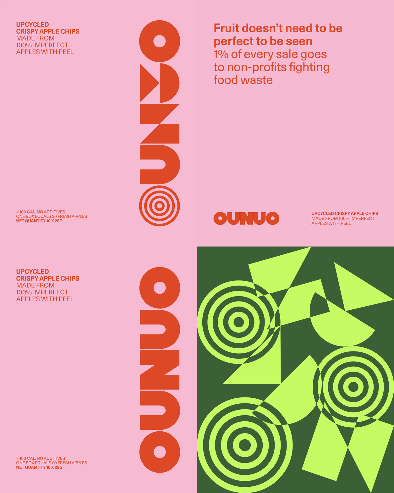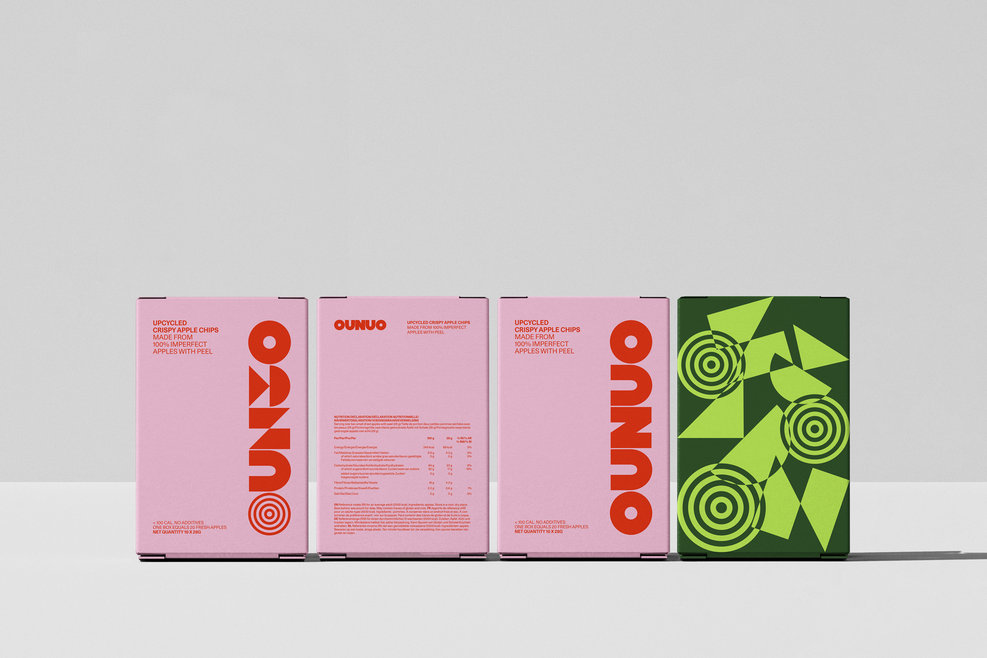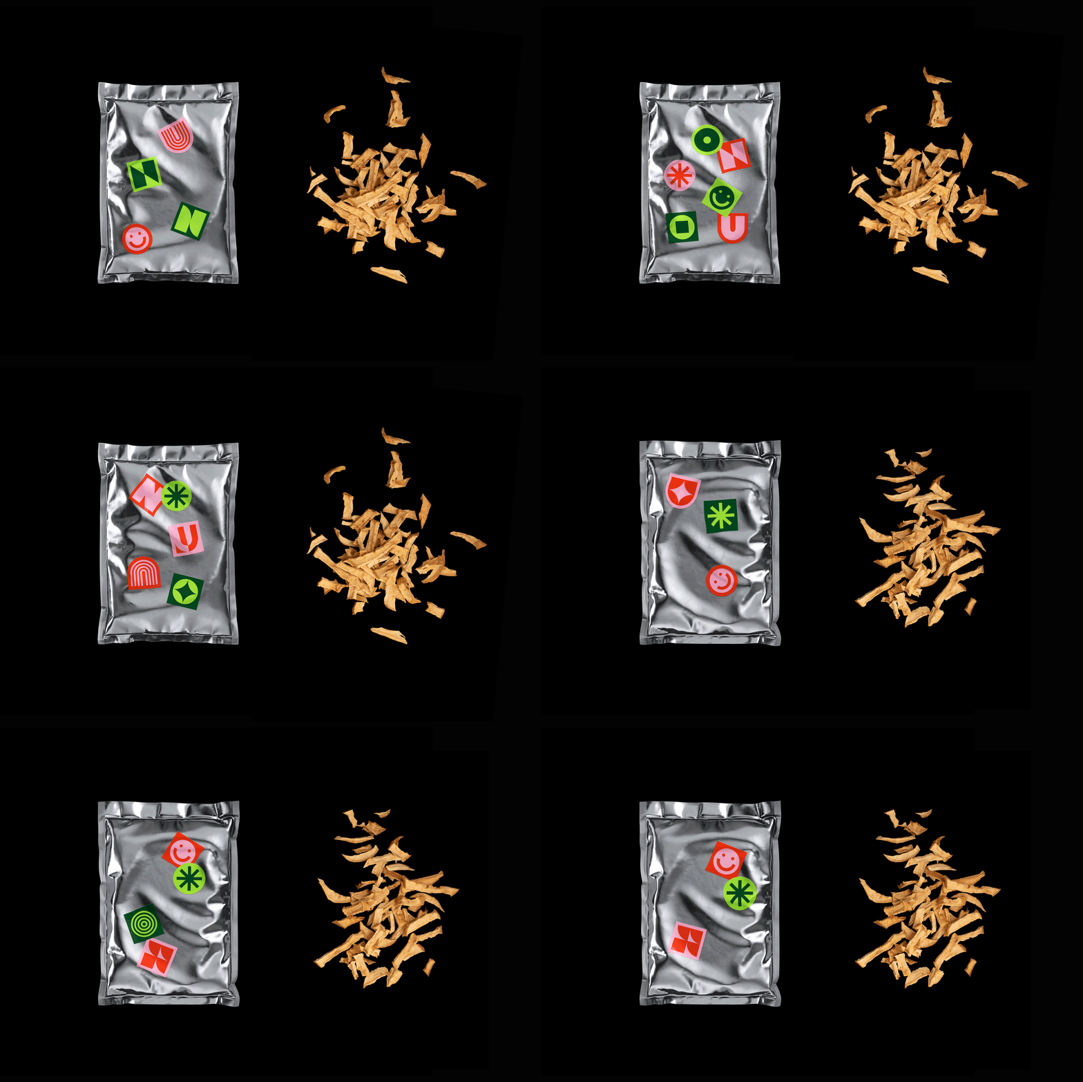
Ounuo is a Luxembourg-based apple chip brand, developed from fruit that does not meet standard commercial criteria and is discarded due to its appearance or size.
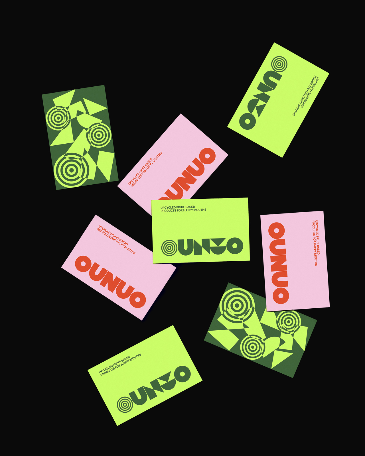
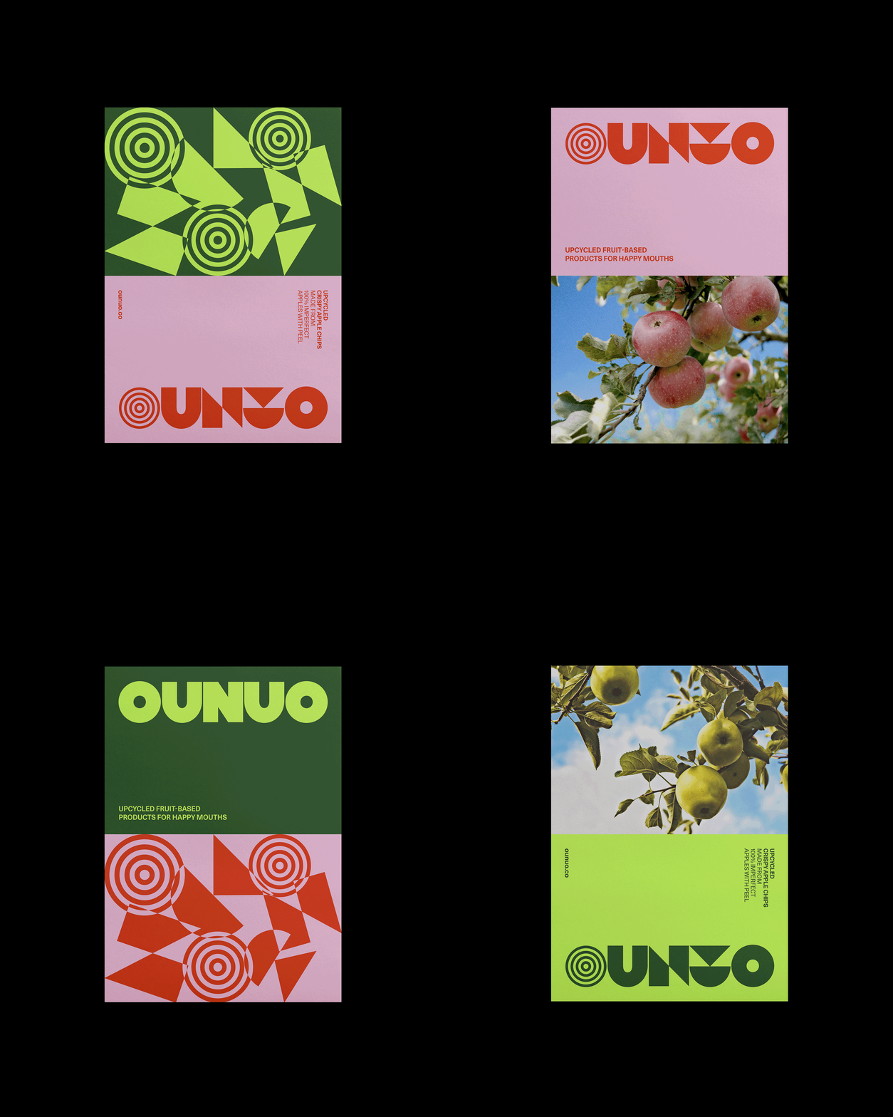
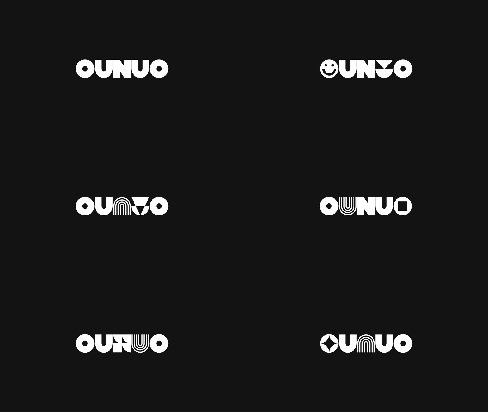
For its identity, a modular solution is proposed, with typographic composition as the central axis and main communication vehicle of the brand. A custom modular logotype, built from simple geometric shapes. Each glyph (O, U, N) has five variations and draws on the language of overlapping elements and the relationship between figure and ground to develop a dynamic and heterogeneous graphic system. The color palette is based on different apple varieties. The result is a dynamic and playful visual identity, with an open graphic system designed to support the growth of the brand and its product range.