This year’s Feria del Libro de Granada celebrates its anniversary with a visual identity renovation. With forty years at it’s back, this event wants to link tradition and innovation by improving the FLG brand graphics this year. It’s time to take a look back and highlight this city’s value of exceptionality and its most open, diverse and international book fair.
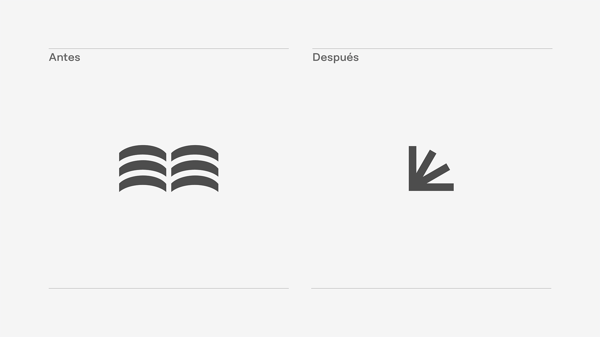
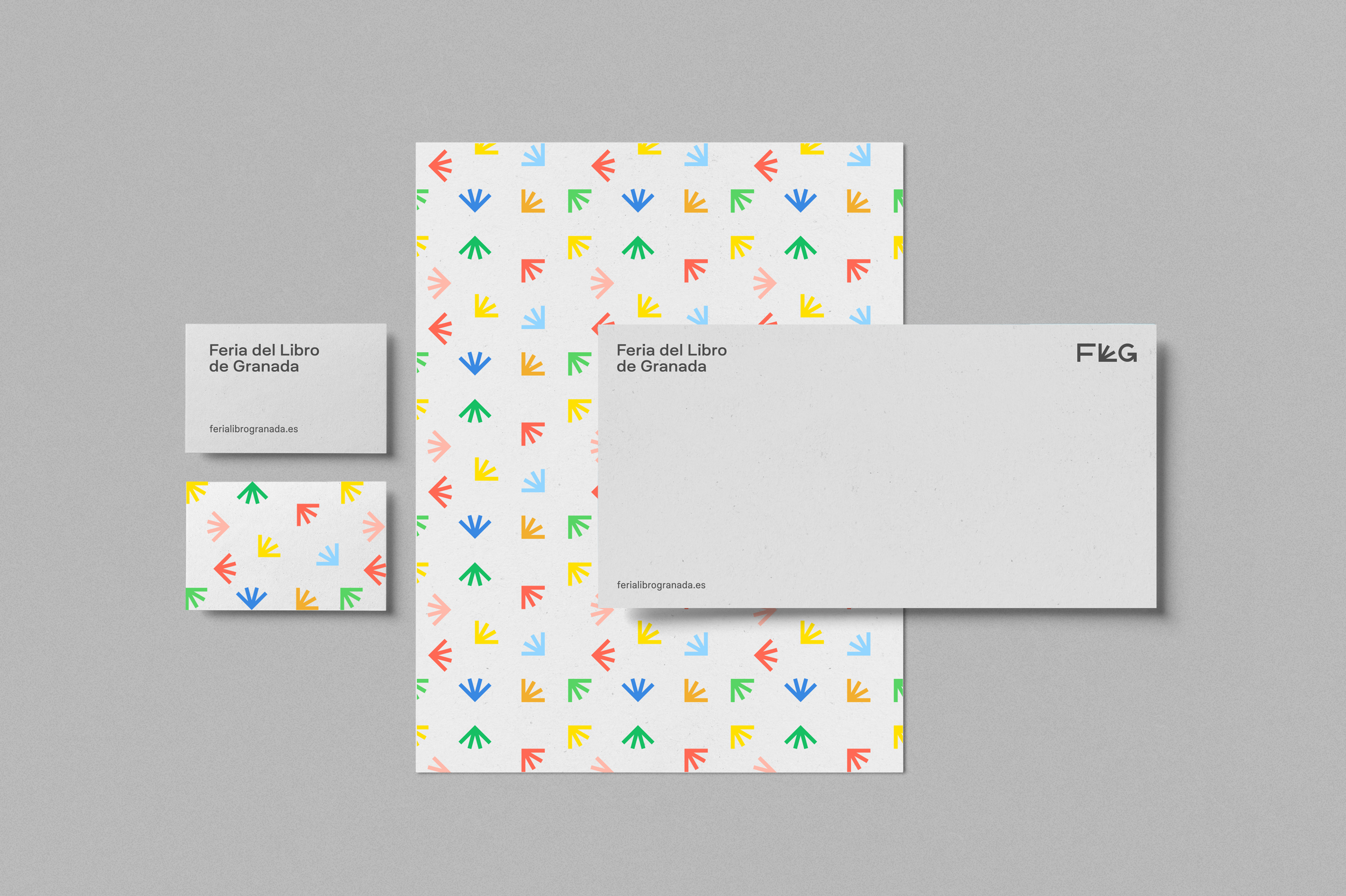
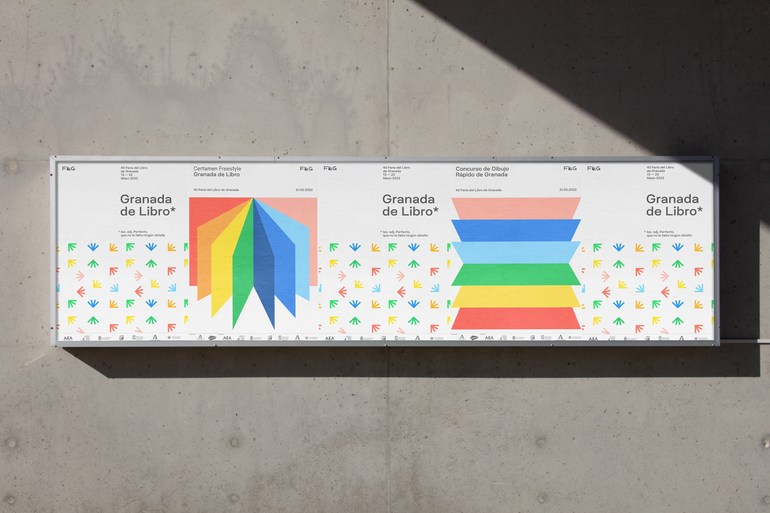
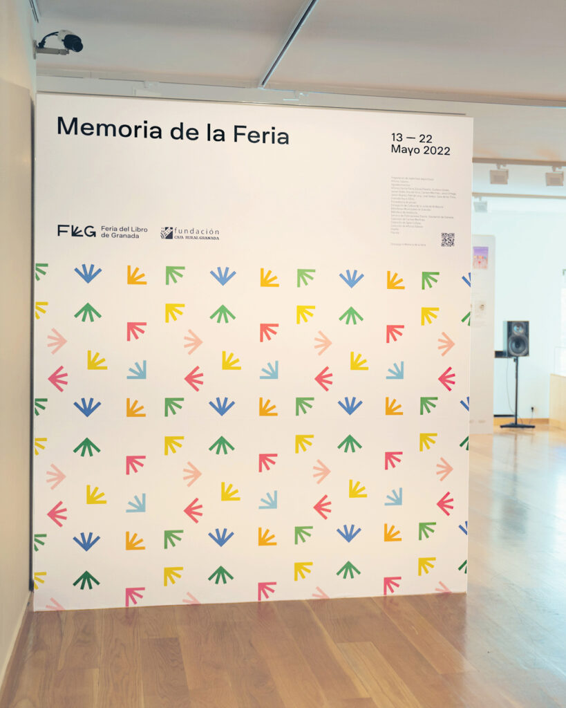
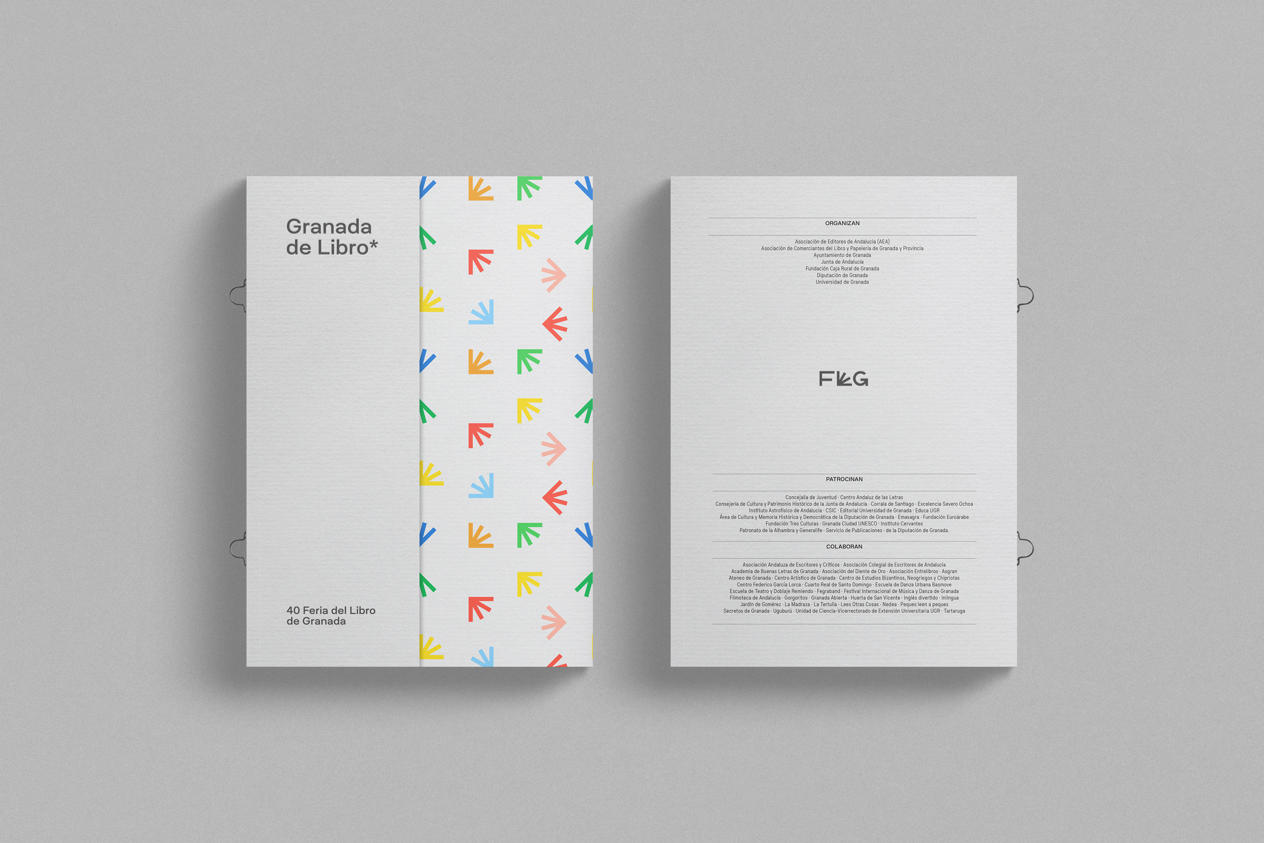
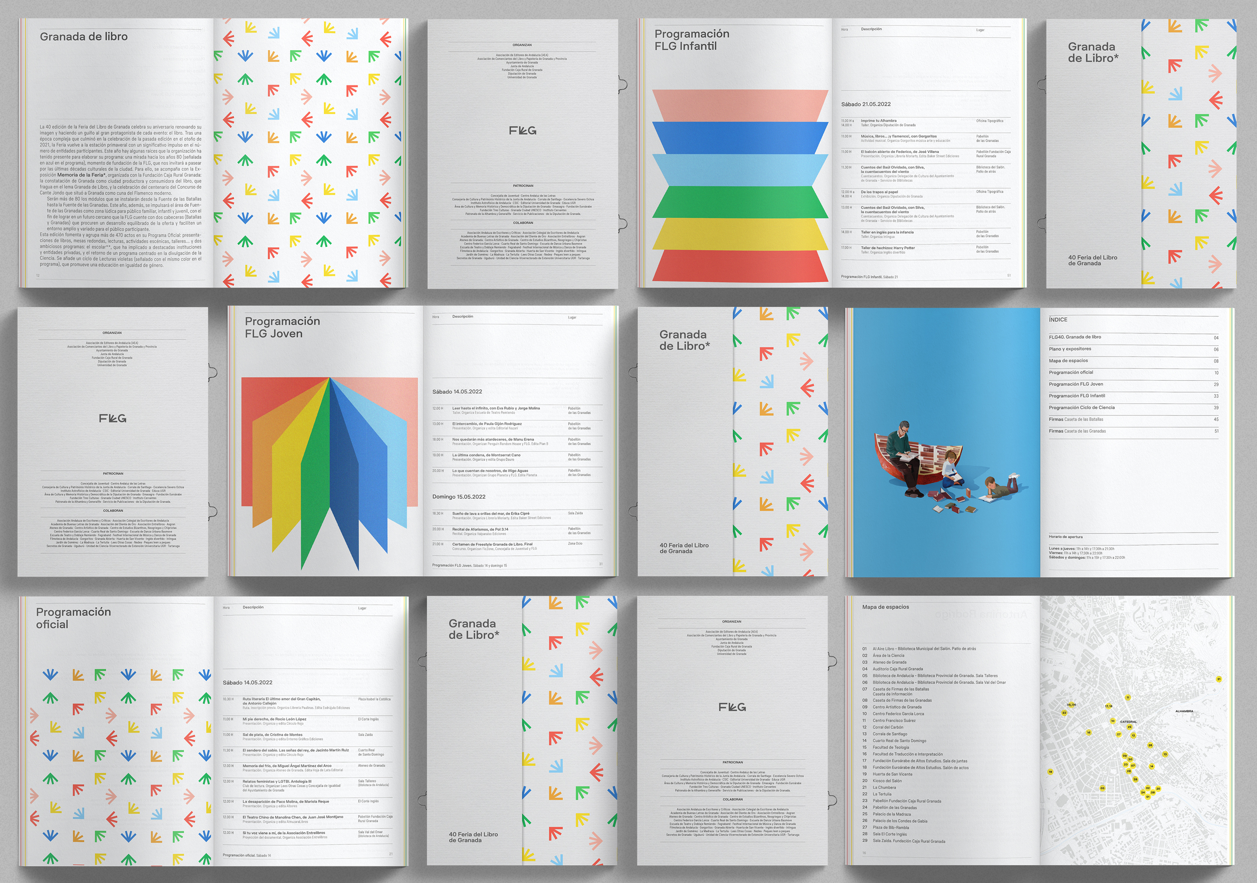
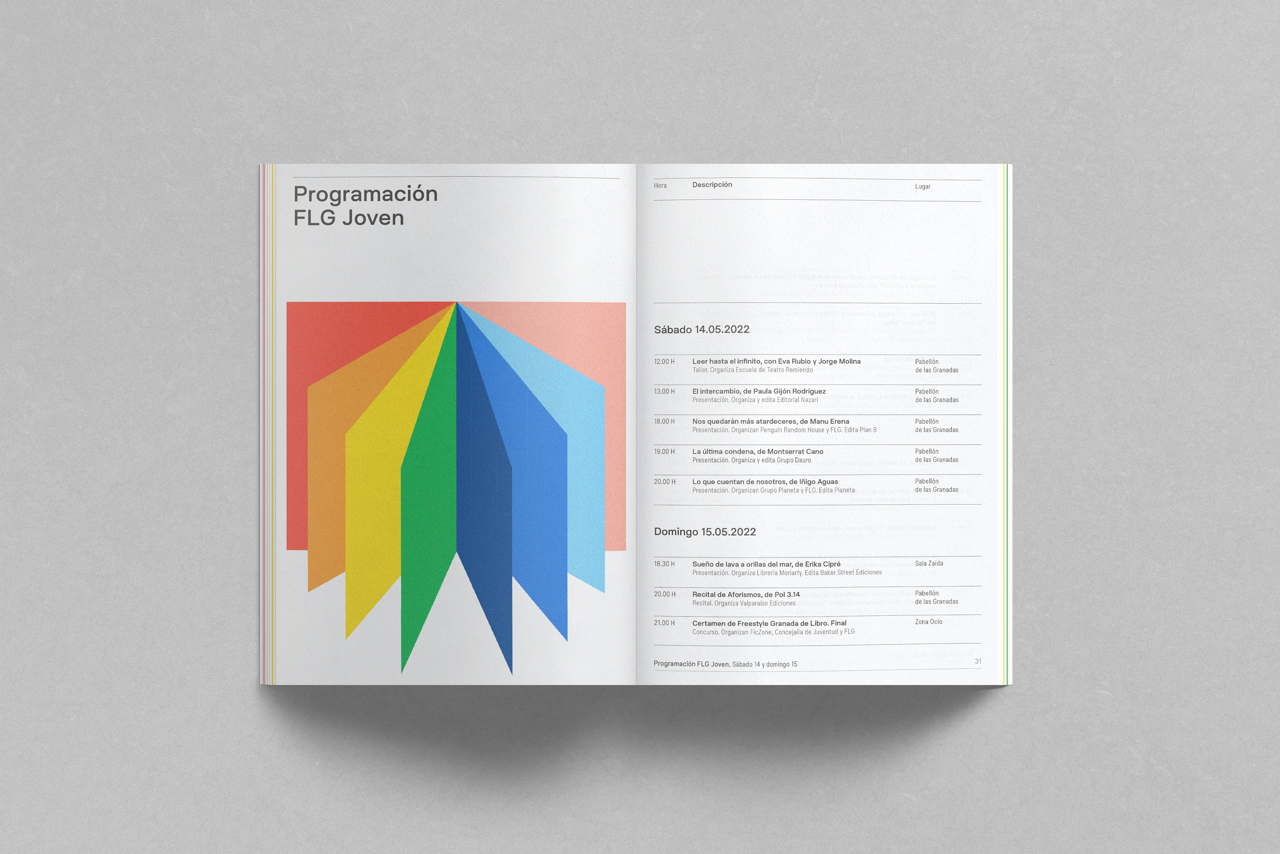
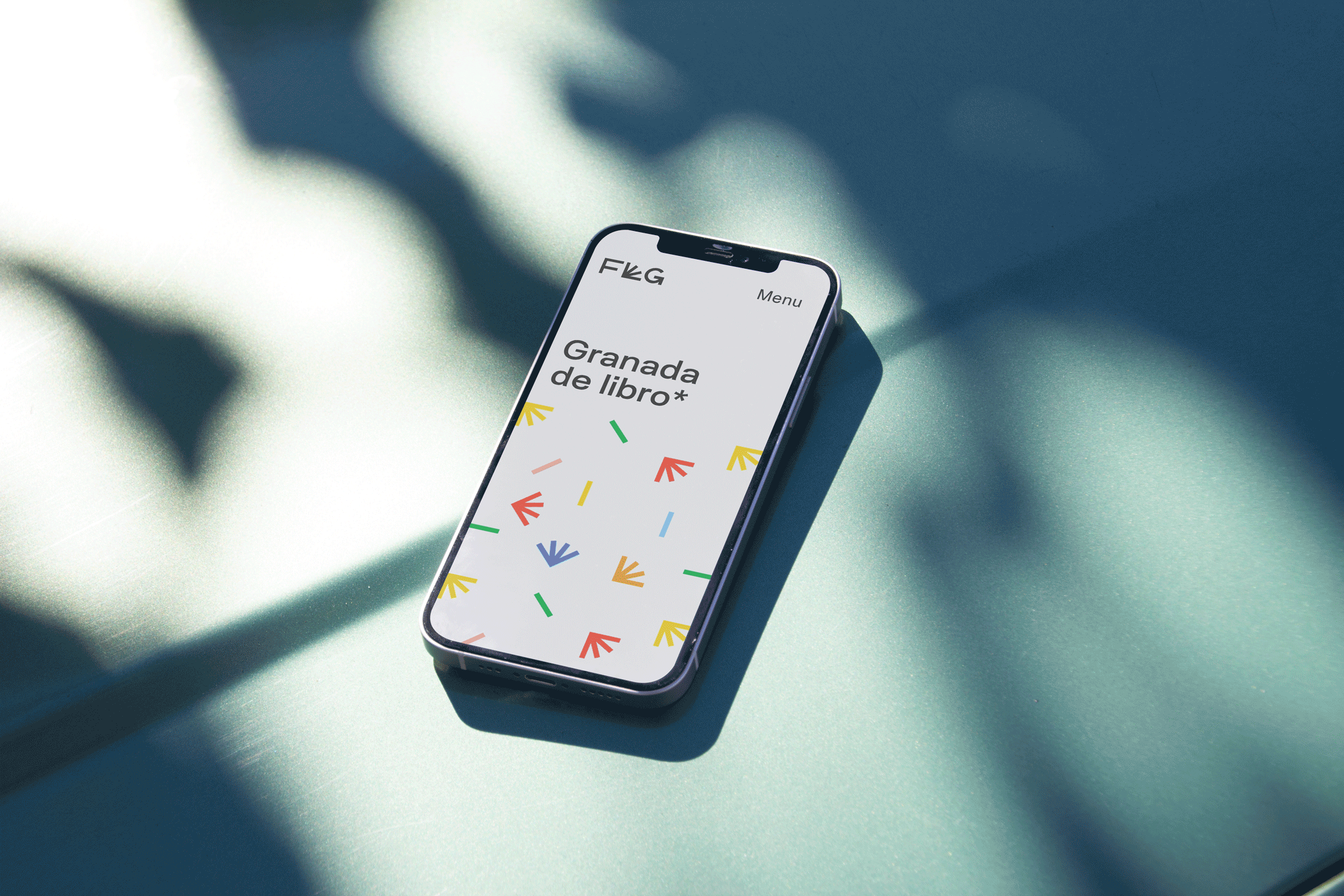
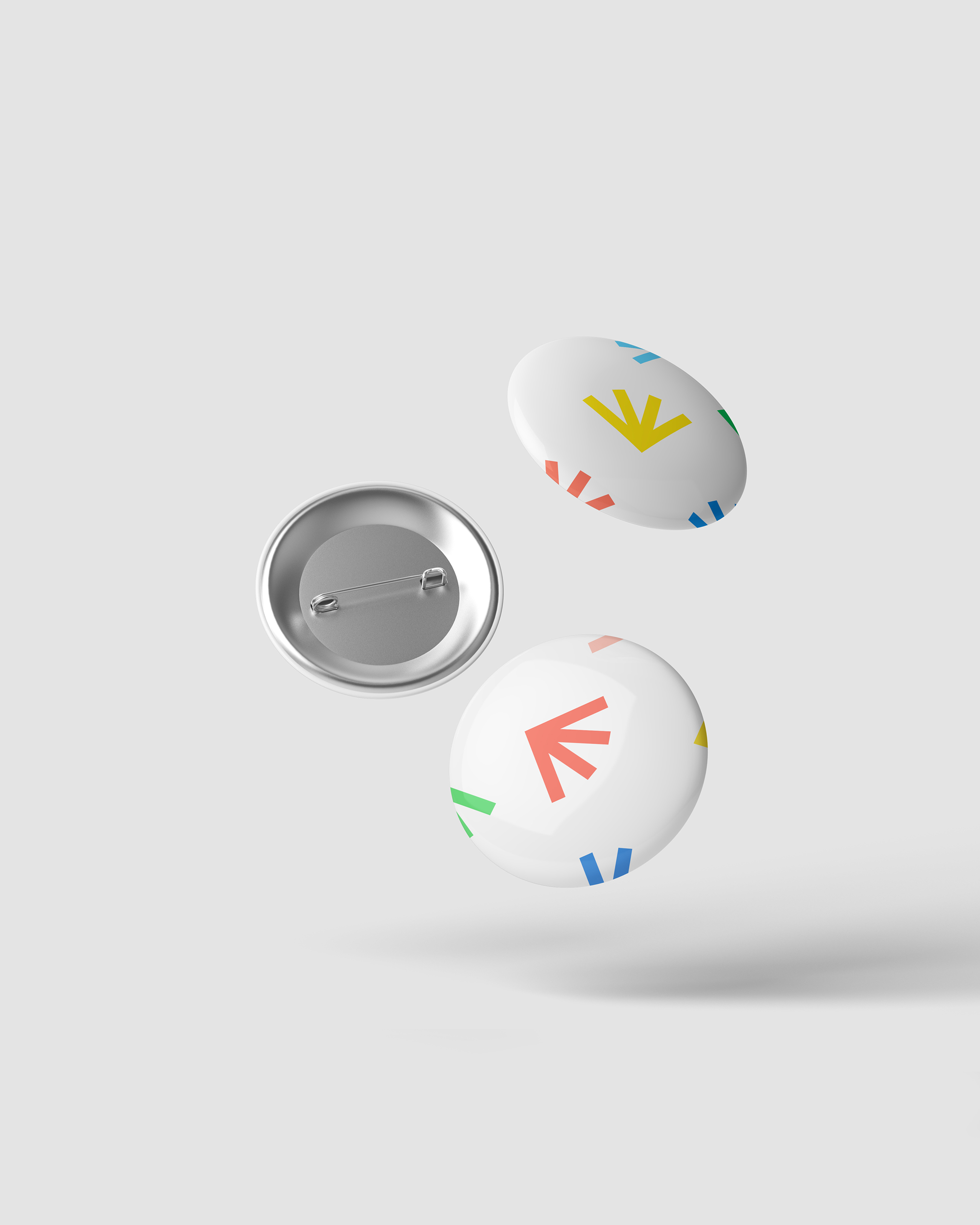
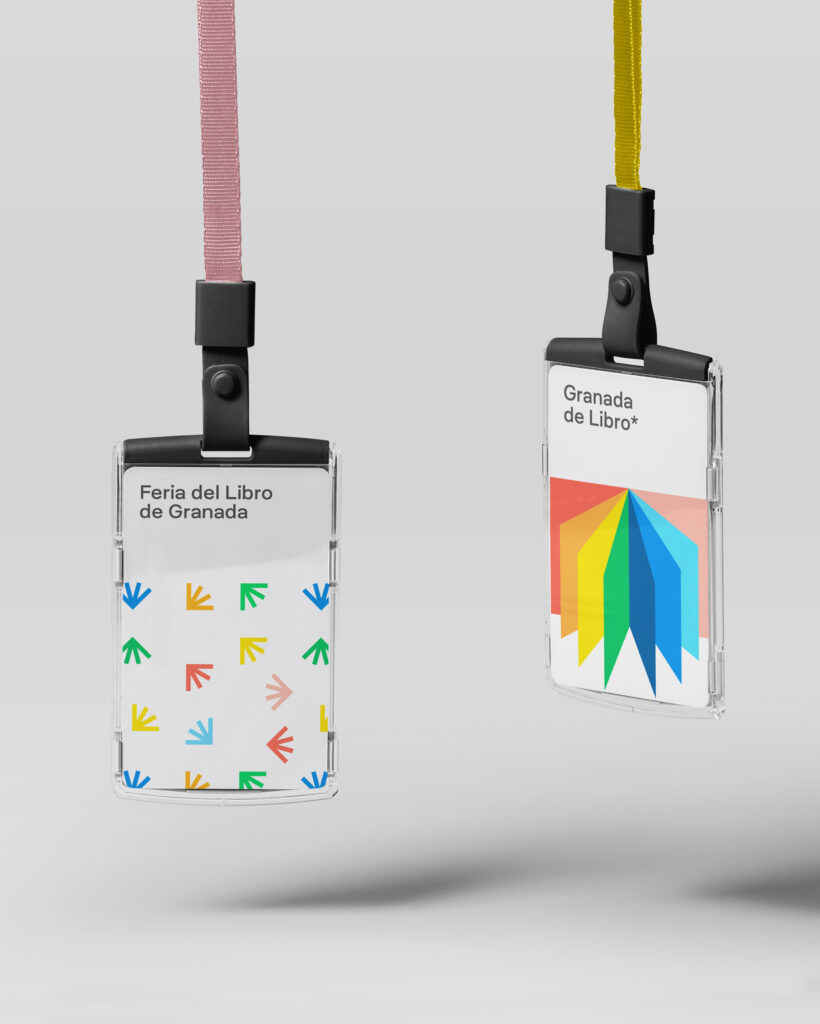
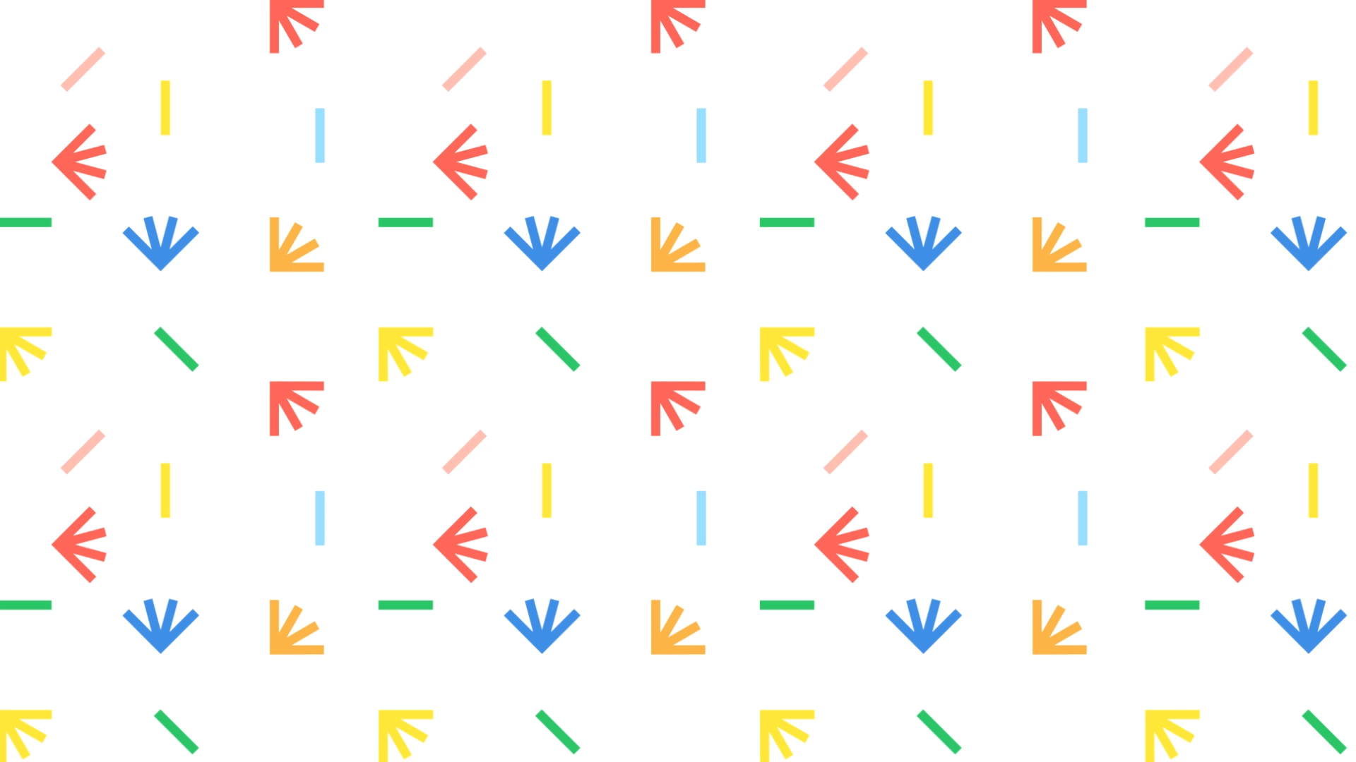
The graphic proposal is an evolution of the previous one, through a renewed and contemporary visual language. We rely on typography as the main communicating element of the brand. The FLG acronym that makes up the logo is built from a common grid where the letter L, from Libro (book), supports the graphic conceptualization and acts as a symbol and minimum unit of identity. From this symbol, represented as an open book, a modular adaptive pattern is built that allows to create printed and digital applications for the brand, forming a solid communication system.