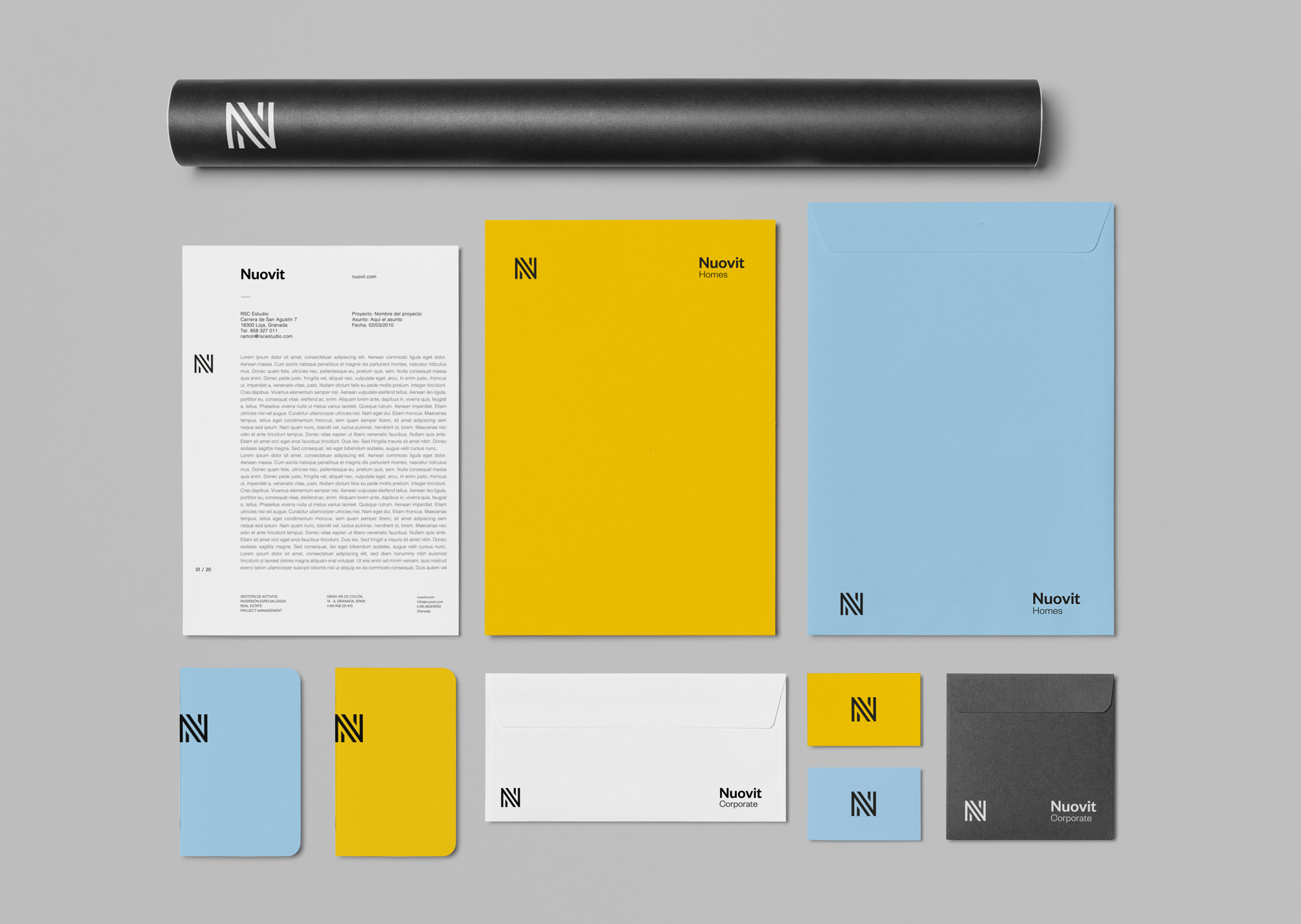
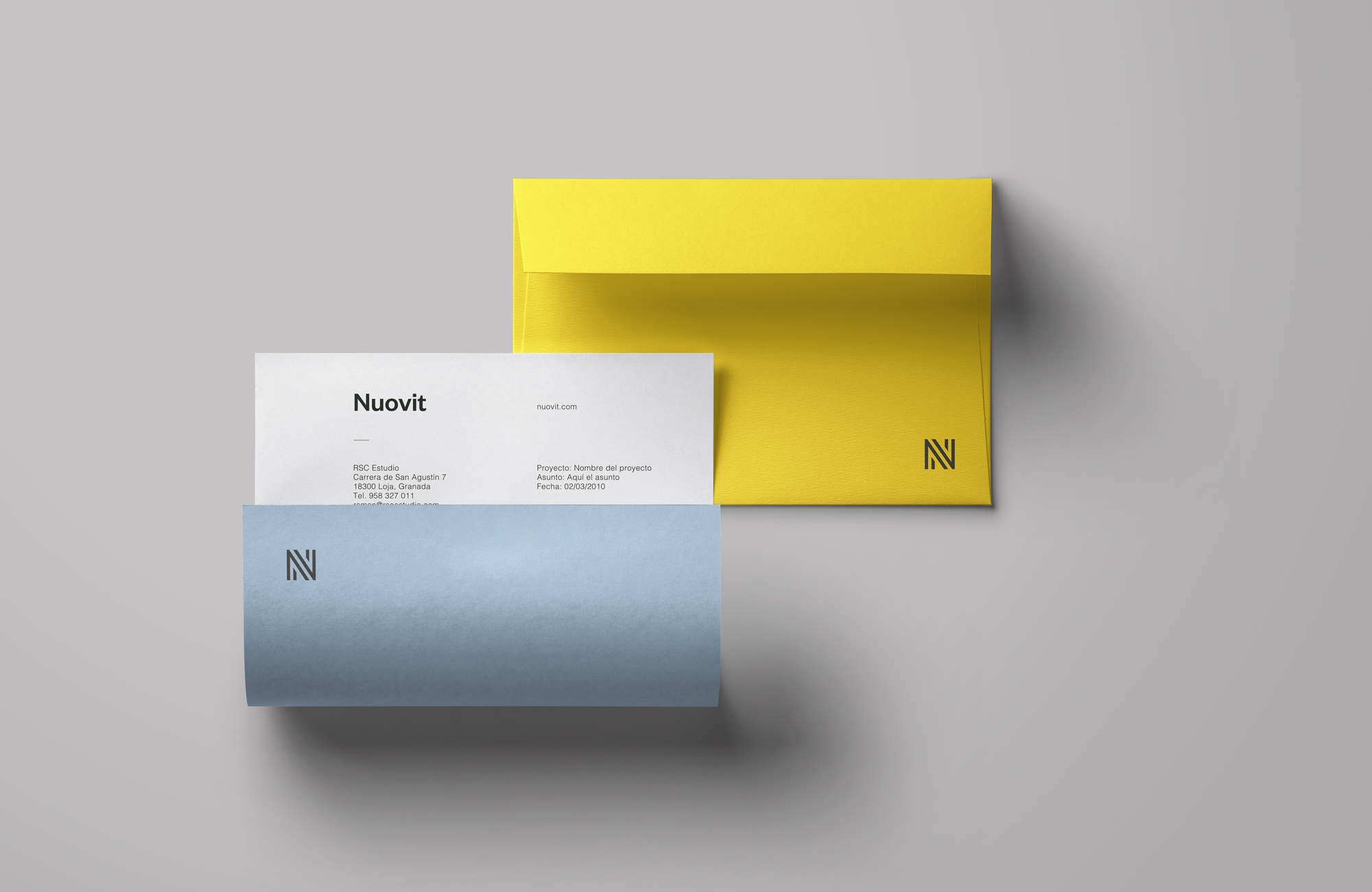
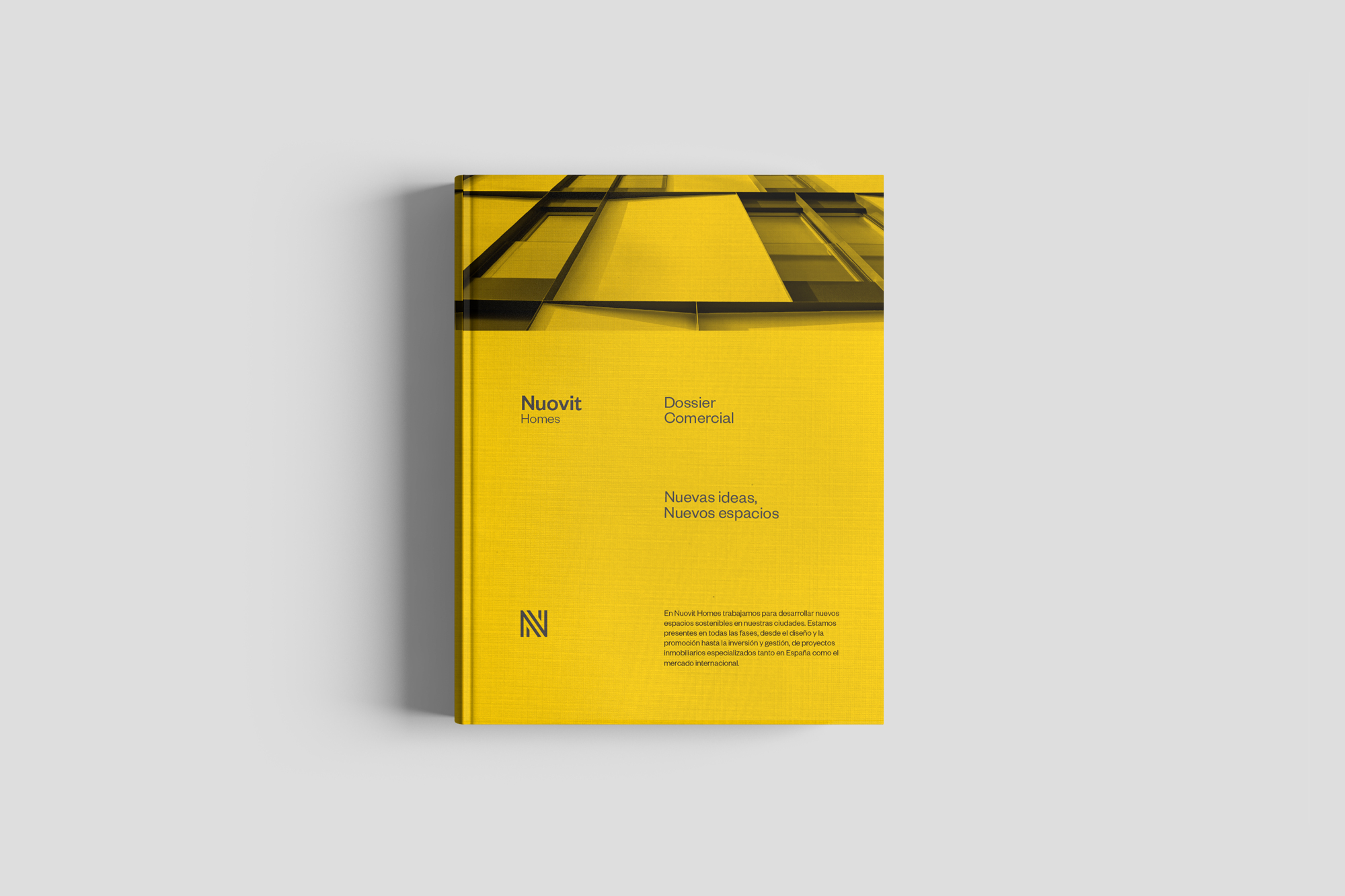
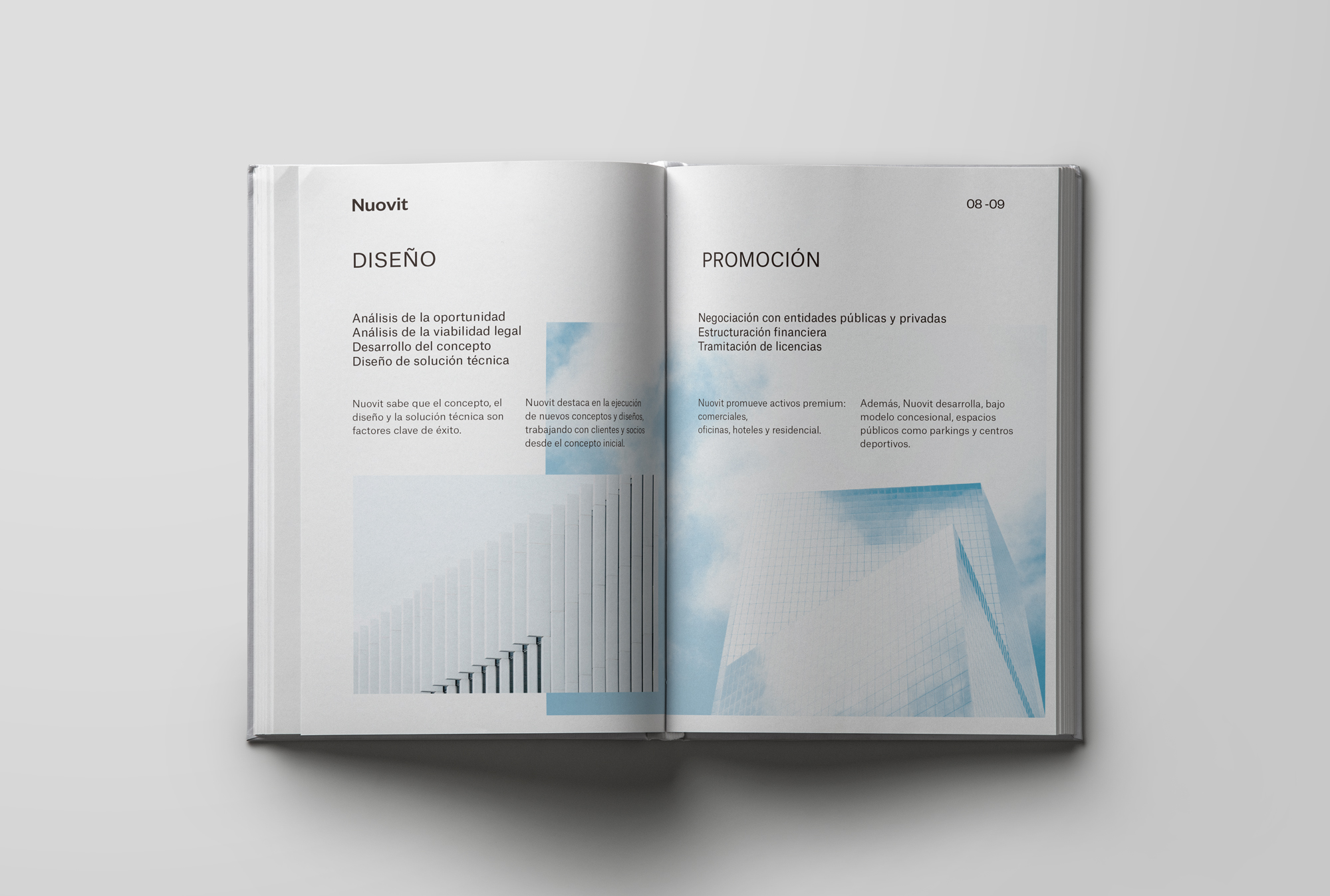
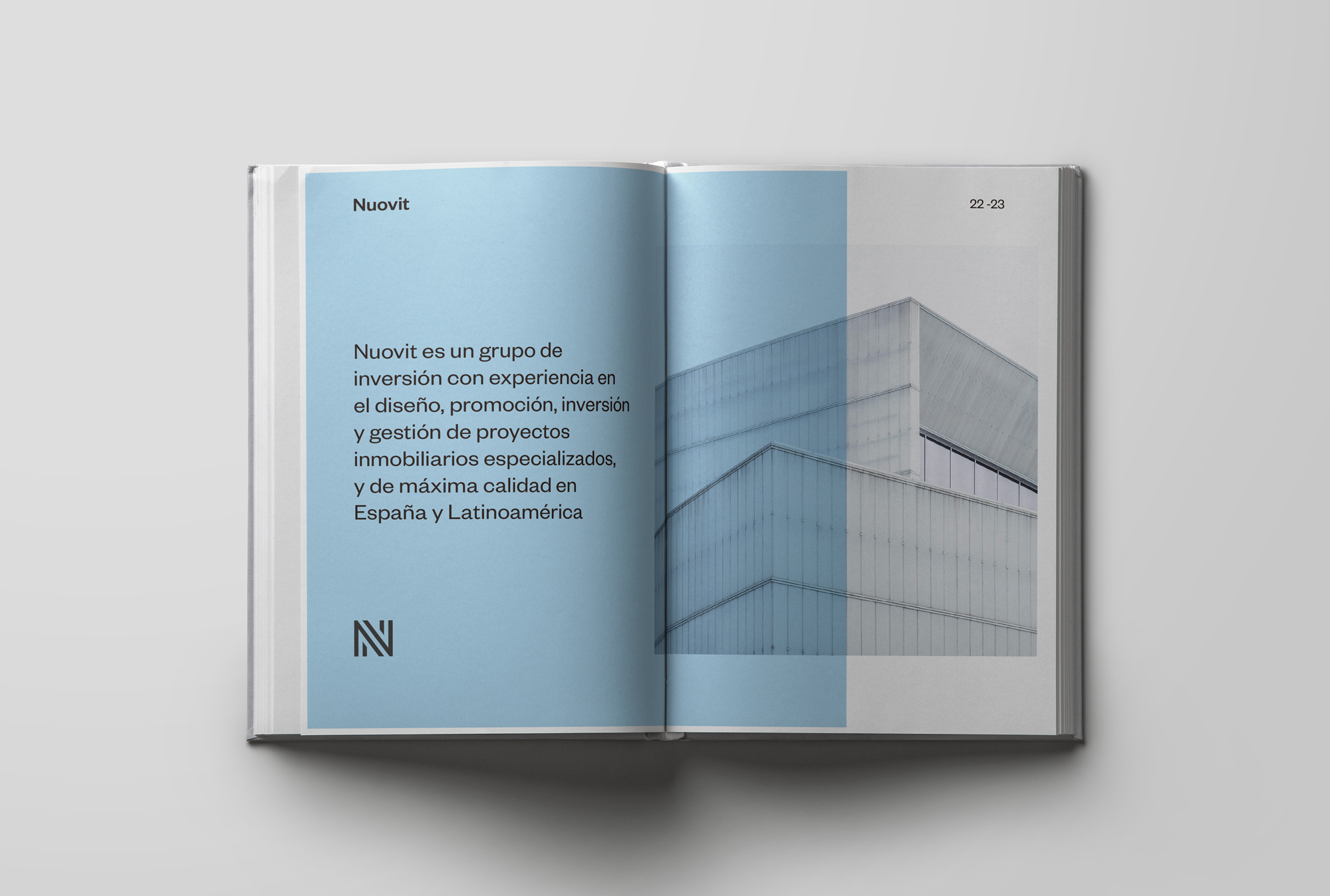
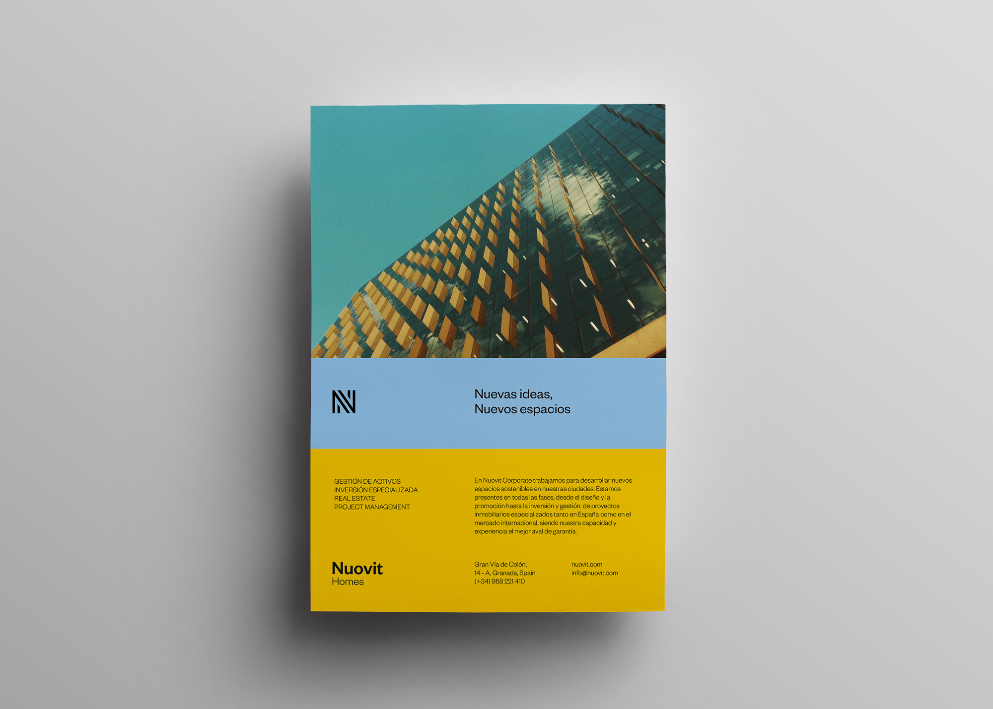
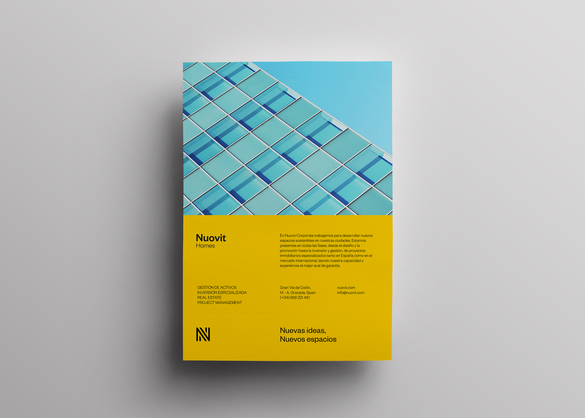
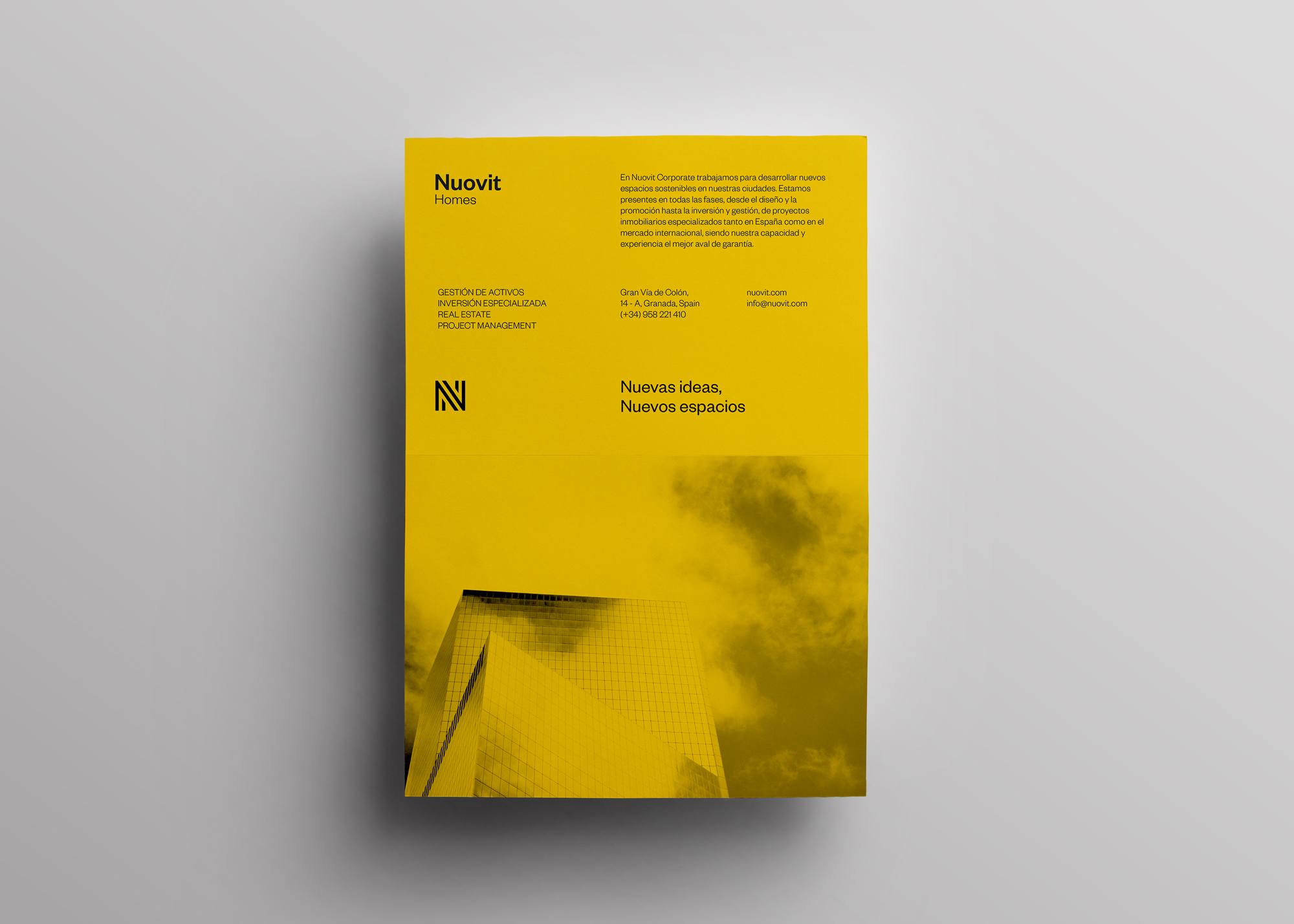
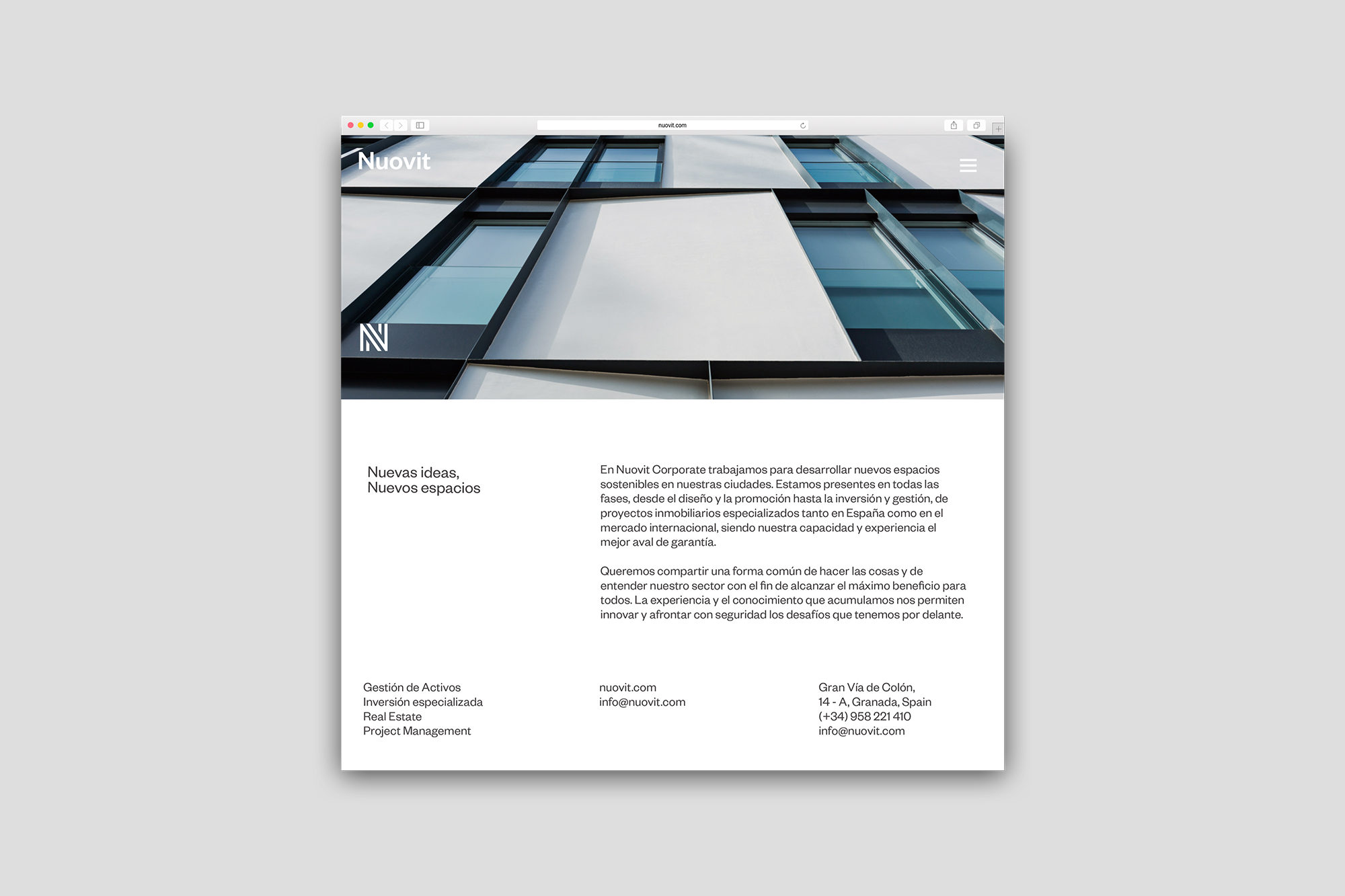
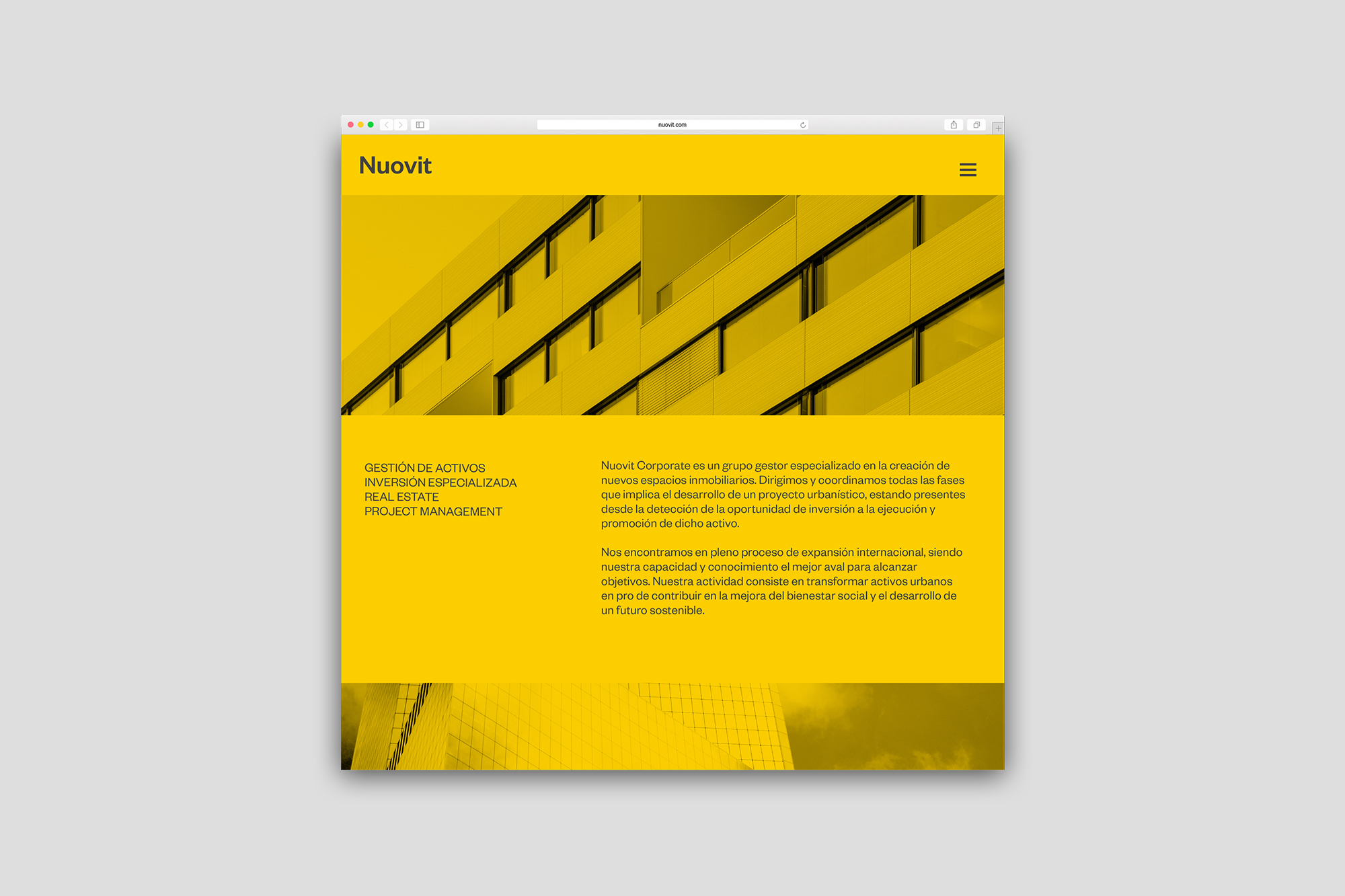
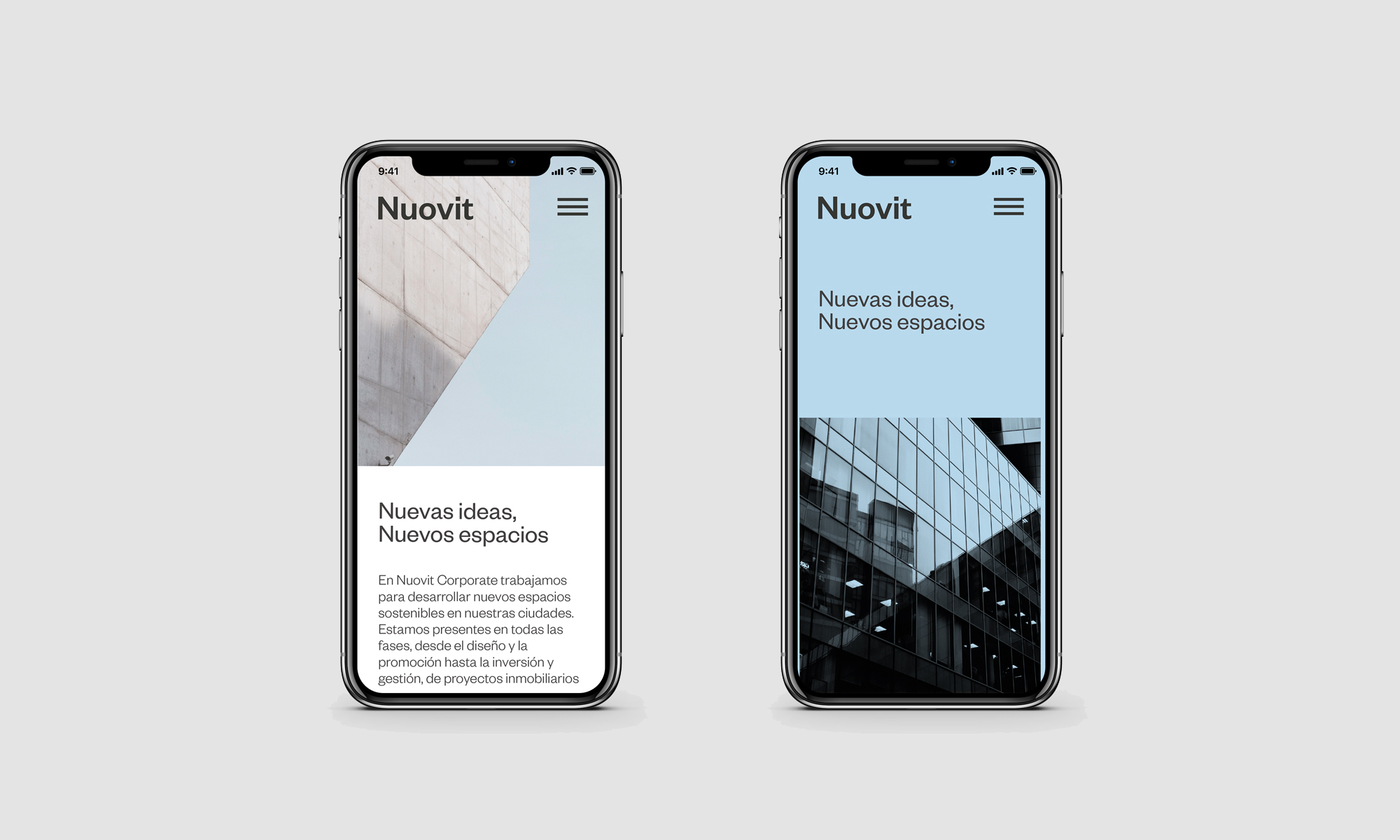
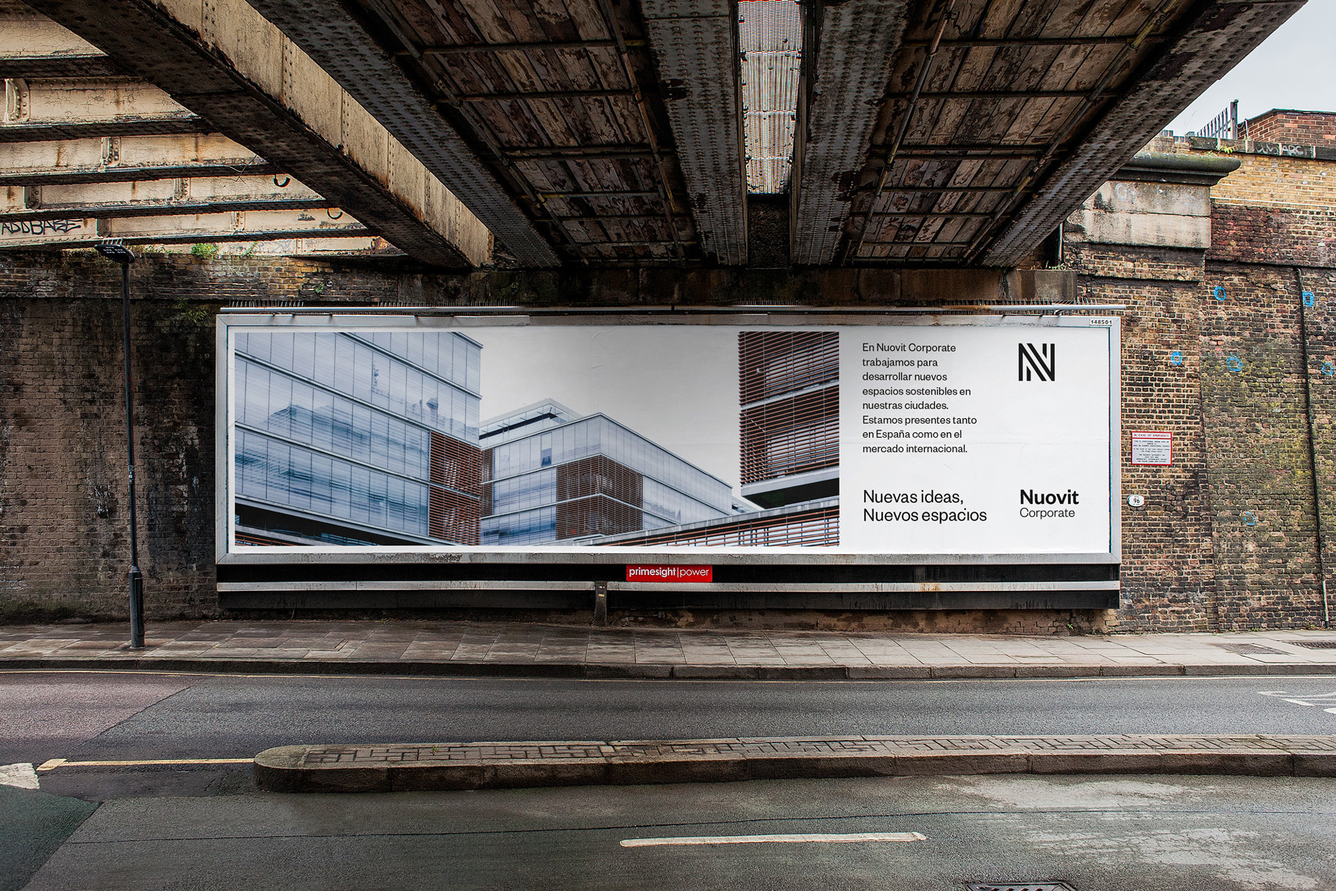
Nuovit is a consultancy firm that specialises in the creation of new real estate spaces. They are currently expanding rapidly at an international level and have been continuously growing by creating new spaces and work teams since 2012. Because of this, a decision was taken to redesign their brand using a dynamic graphic system in order to give each section that makes up this company its own place within a shared brand ecosystem.
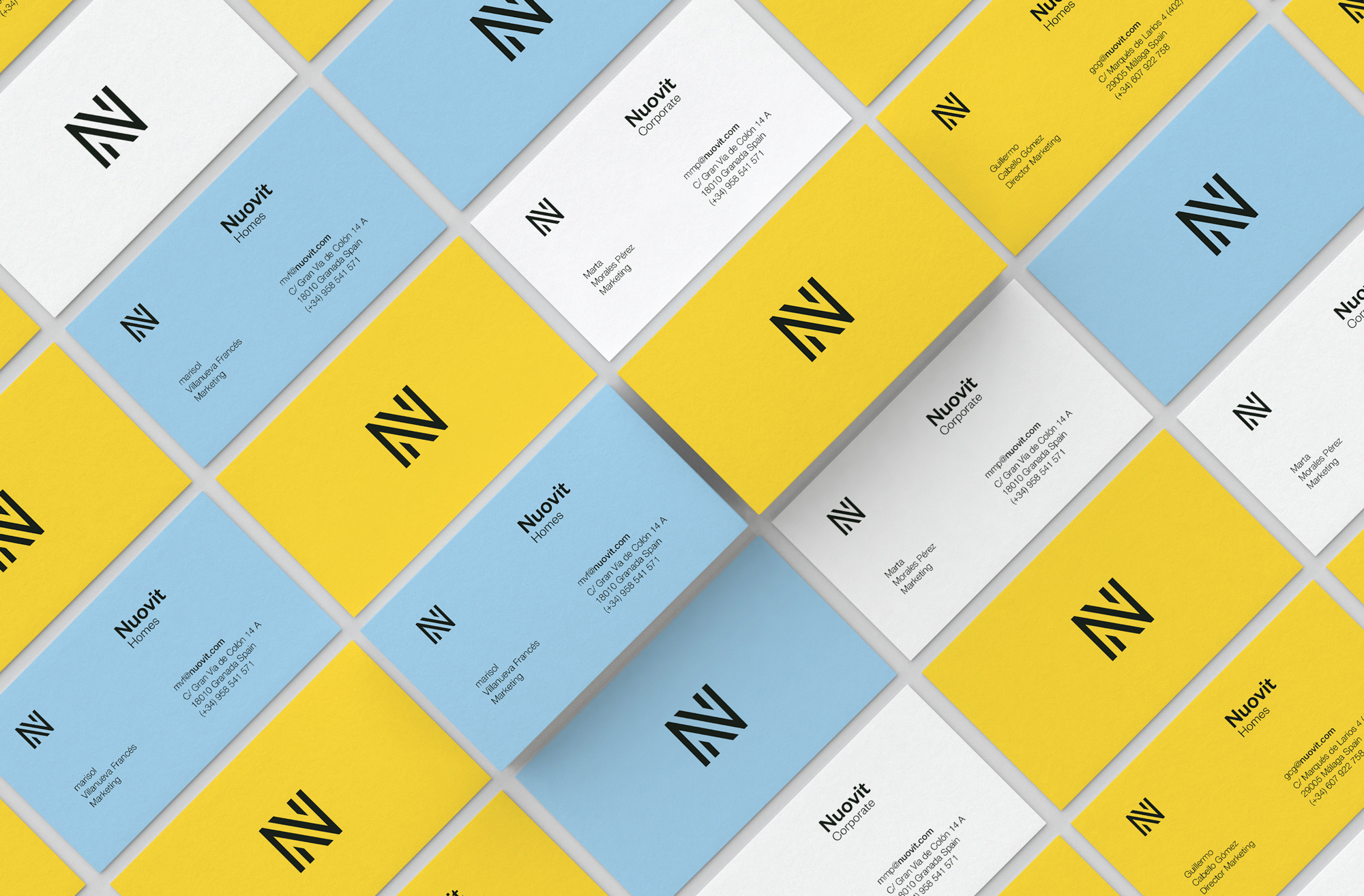
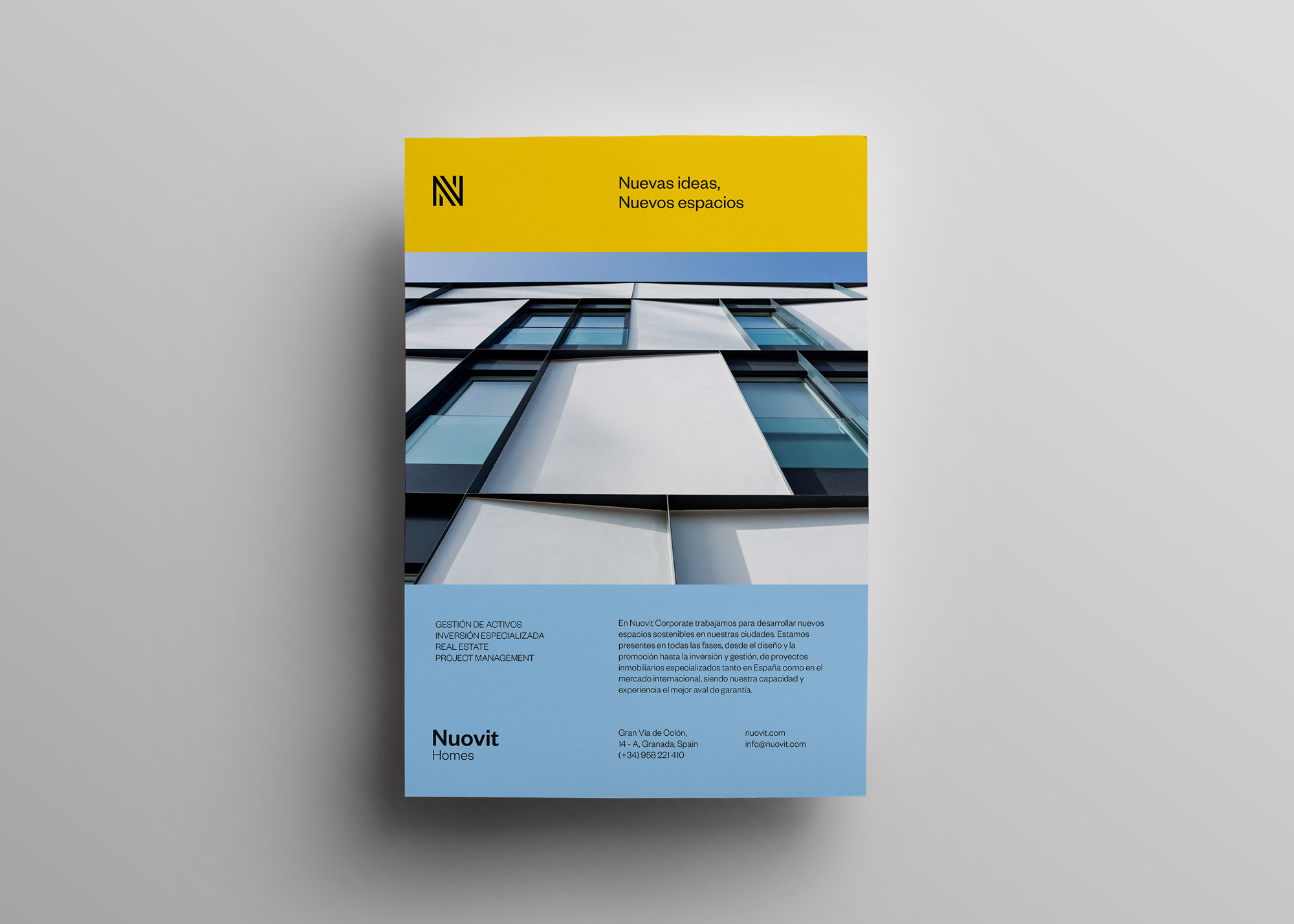
The setting is multicultural and therefore multilingual. The brand had to be designed taking into consideration not only this factor, but also the amount of competition they would come up against. For this reason a grapheme was used as the base for the design: we chose the letter ‘N’, the first letter of the name of the company, using visual language to make a reference to the verbal language of the name. Even though the icon created from the grapheme is not an image typically associated with this type of company, it can be linked to its corporate brand.
One thing which the company wanted was a logo which was conceptually linked to the company’s name, maintaining in some kind of way the six bars which formed its previous logo and at the same time reducing the corporate chromatic range. The result is a conceptual evolution of the brand.