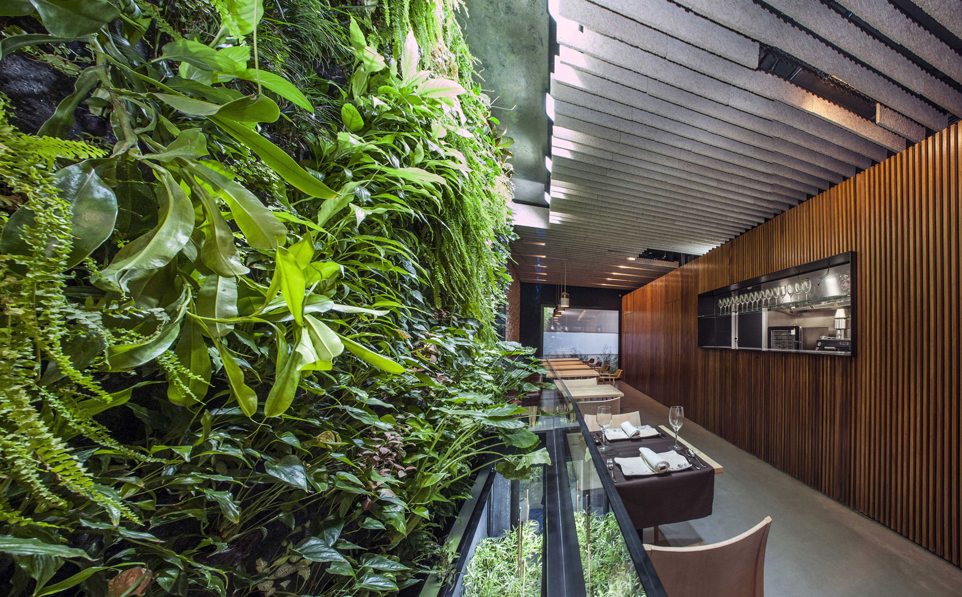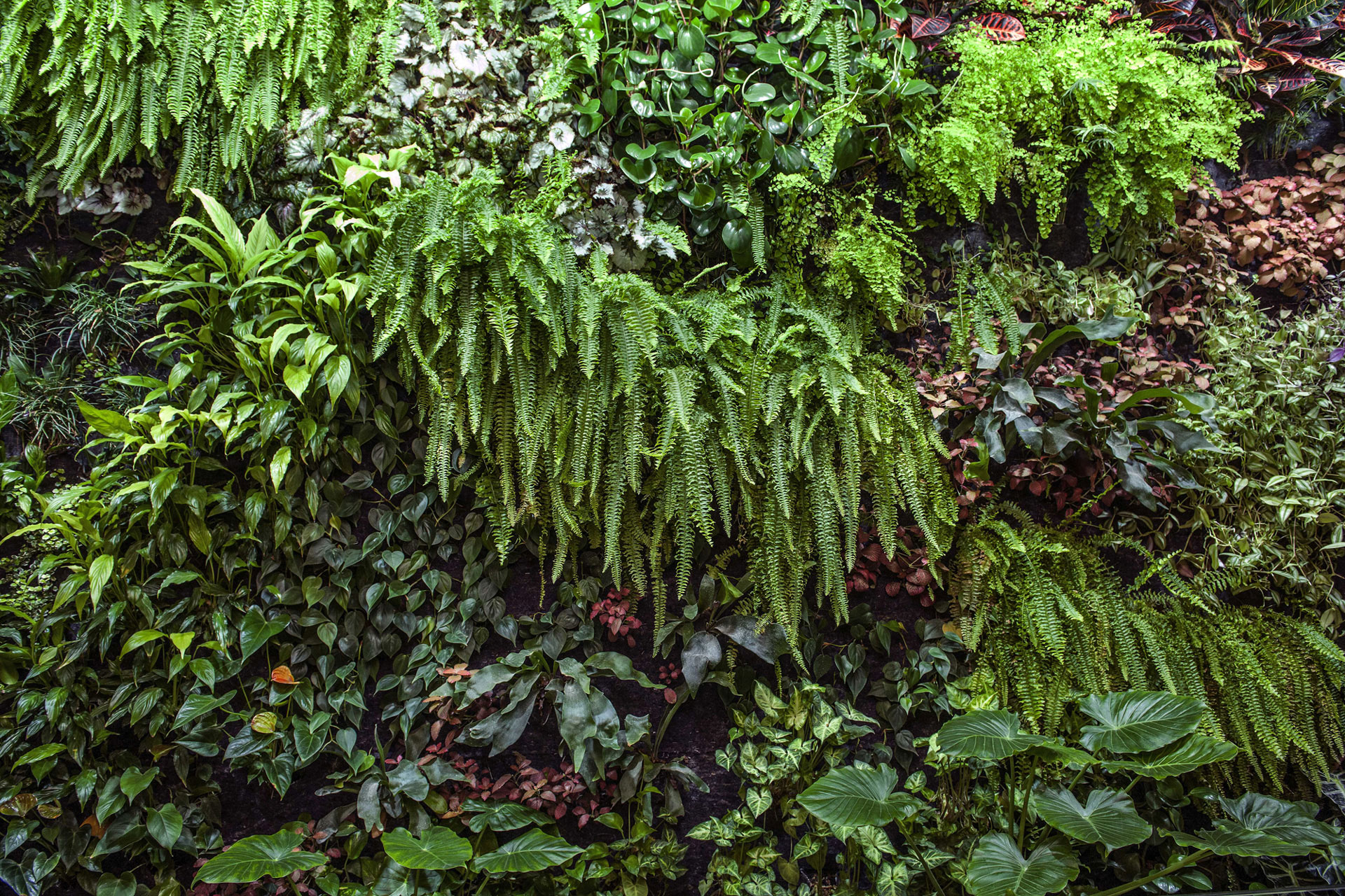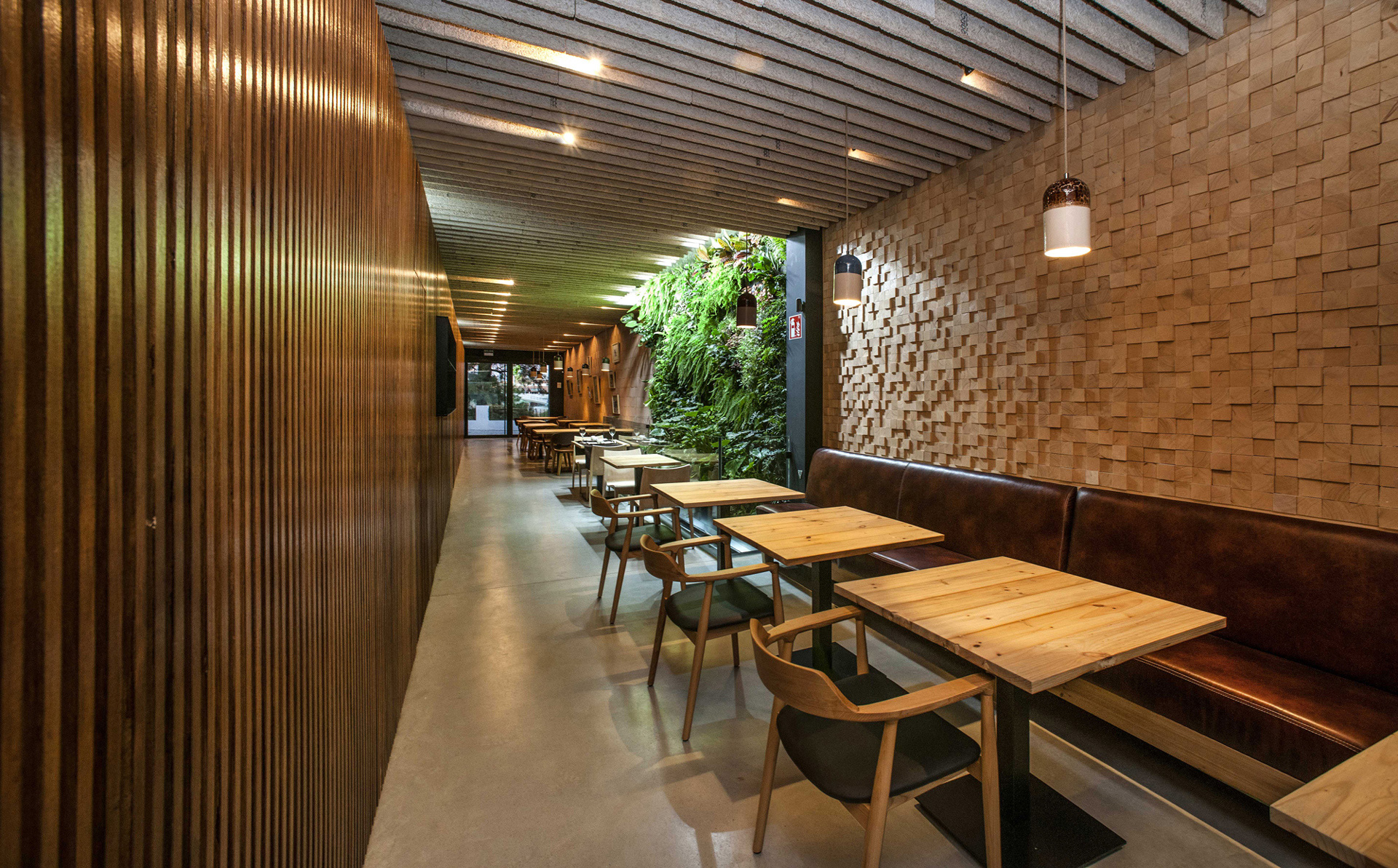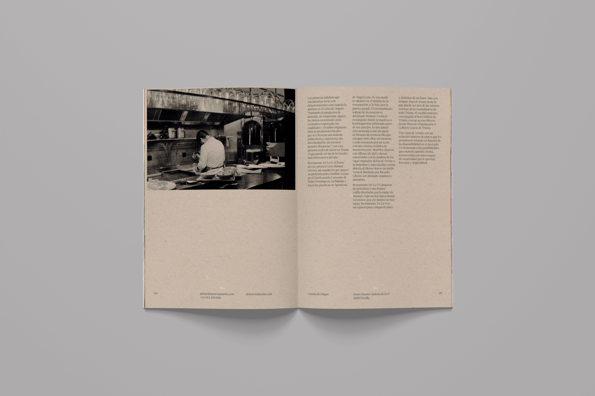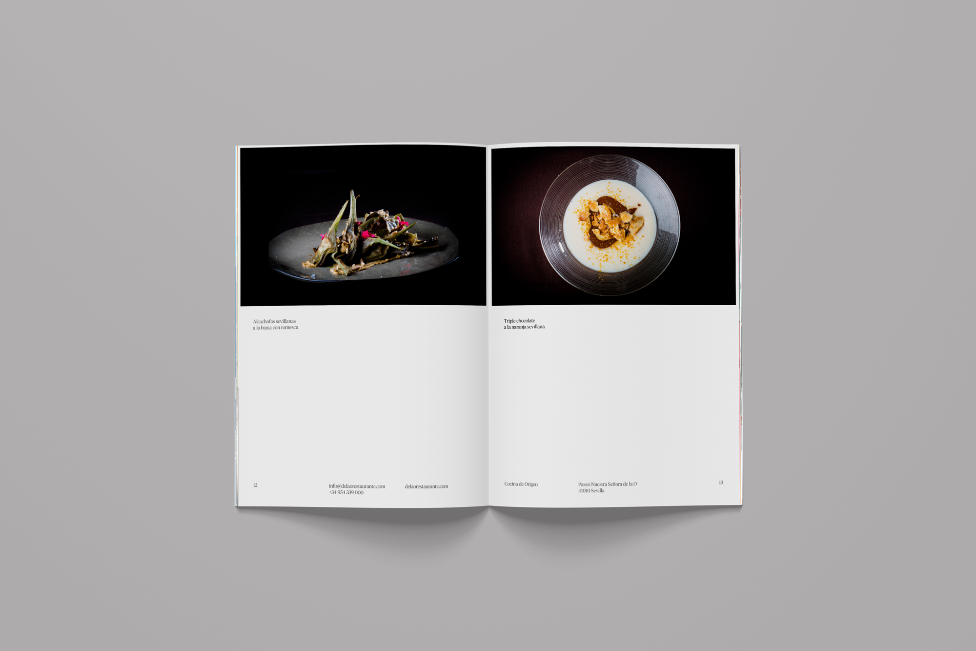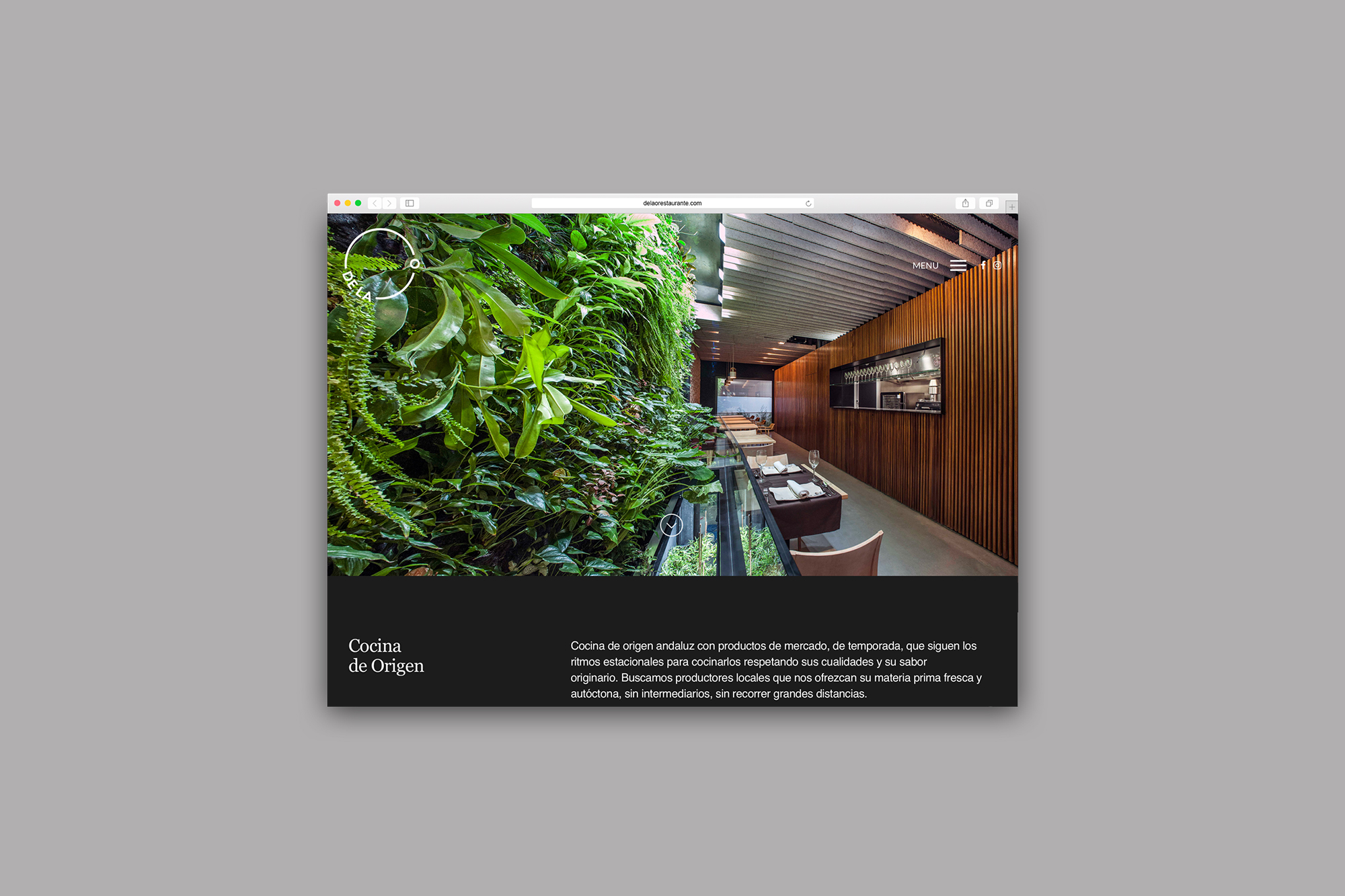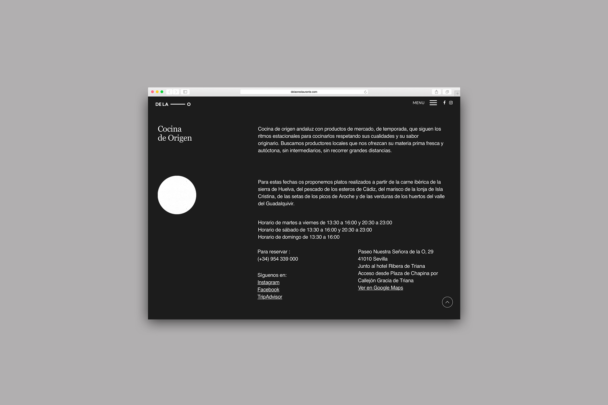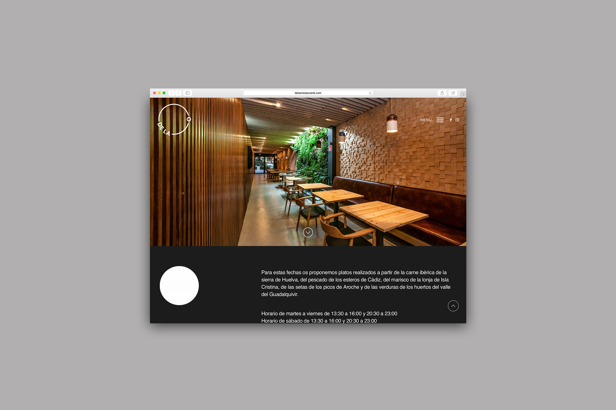
Named after its place of origin in the neighborhood of Triana in Seville, ‘De la O’ has become one of the most highly regarded restaurants in the city. It is located in a street called ‘Paseo Nuestra Señora de la O’, a magical place on the banks of the Guadalquivir river. It is characterized by its food, which is typical of the region, organic and Km 0. The dishes are made using seasonal products, making the most of their original qualities and taste.
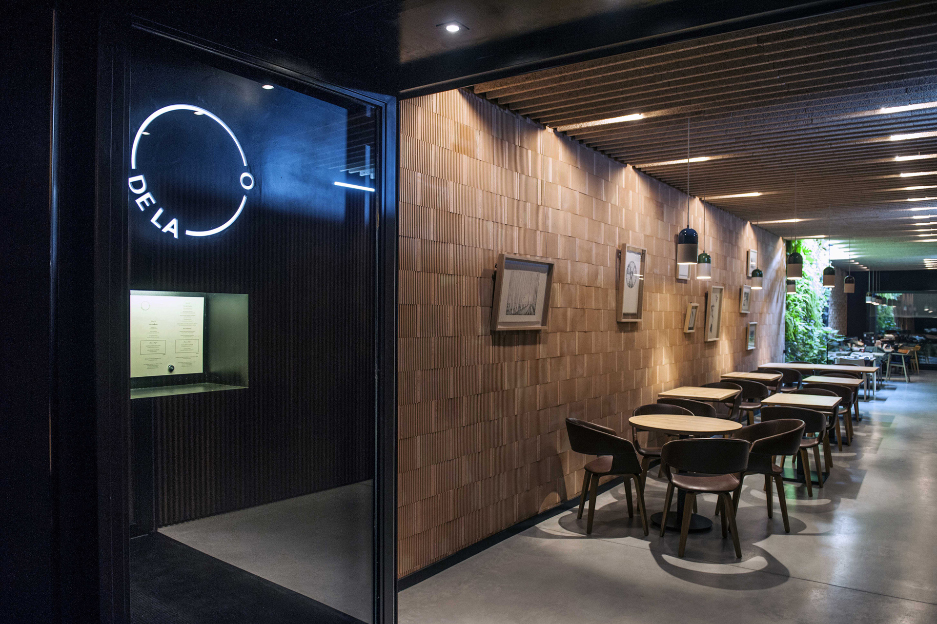
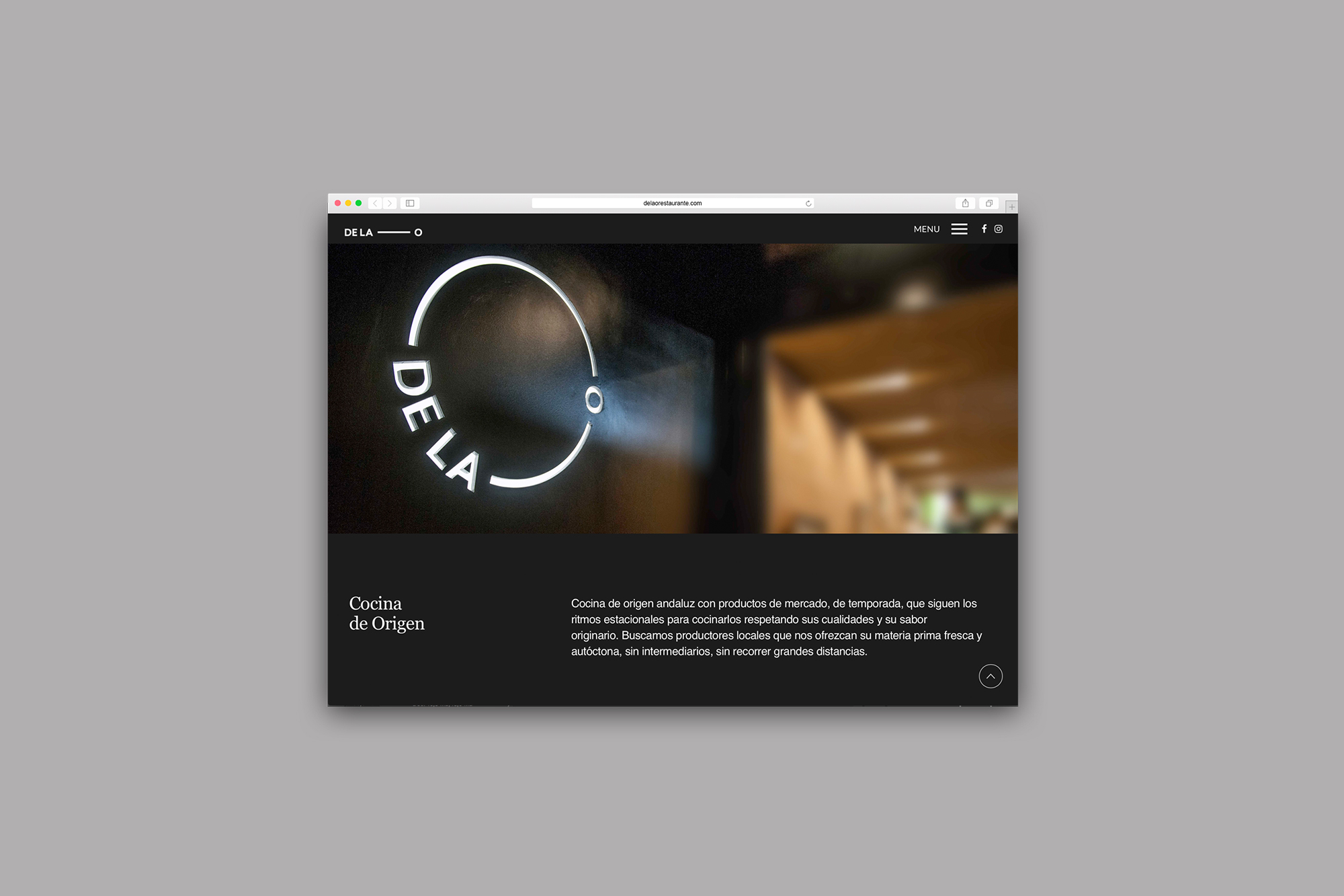
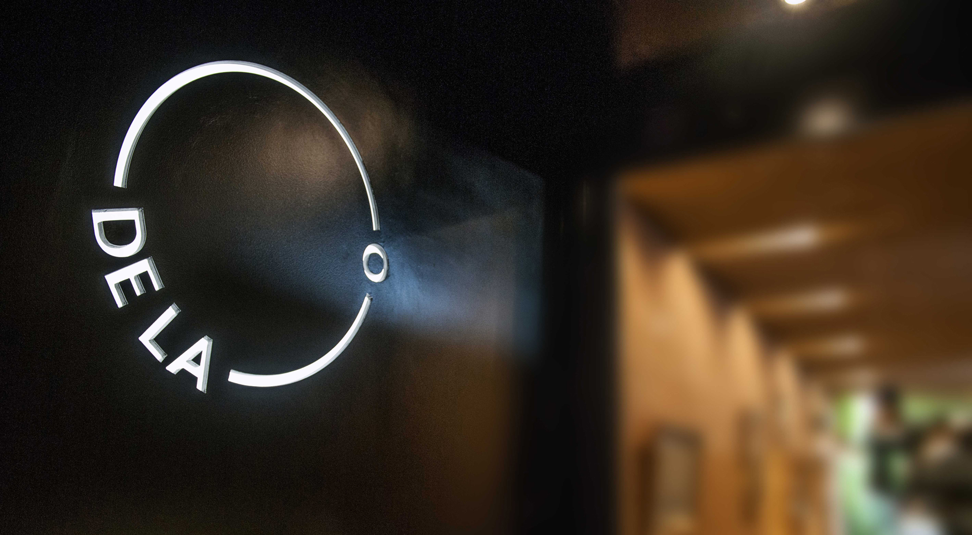
The letter O acts as a link between the restaurant, its name, its style of cooking and the street where it is situated. These elements were used for the concept and graphic development of the brand. The main logo is formed by an O, a circular form which can be commonly found in the neighborhood and has greatly influenced our final product. These circles are part of the iron structure of one of the most emblematic monuments in the neighborhood, Triana Bridge. It is located next to the restaurant and its circles connect the neighborhood to the rest of Seville.


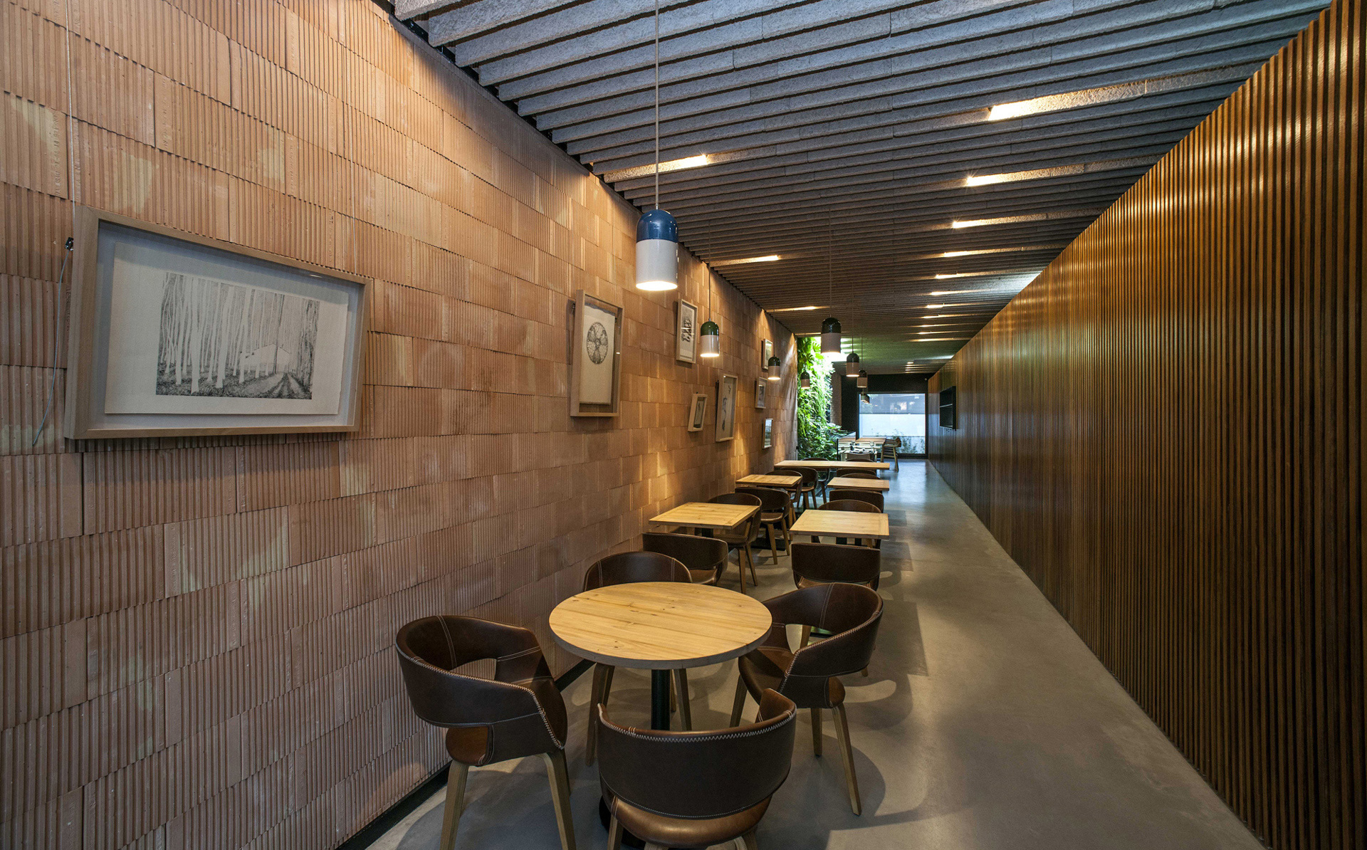
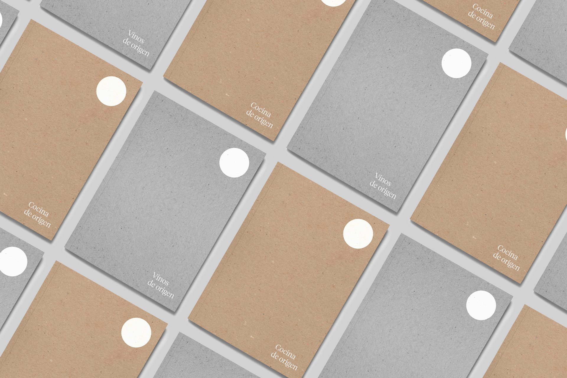
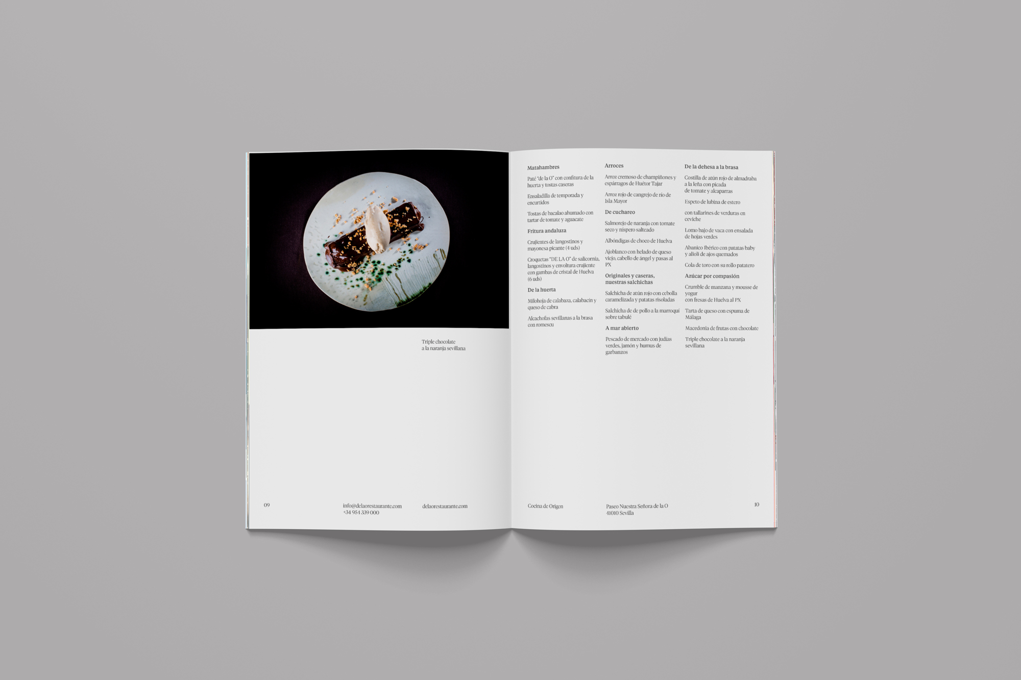
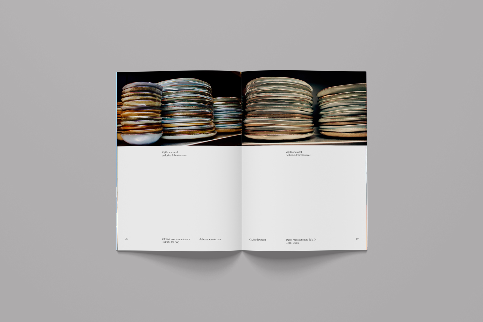
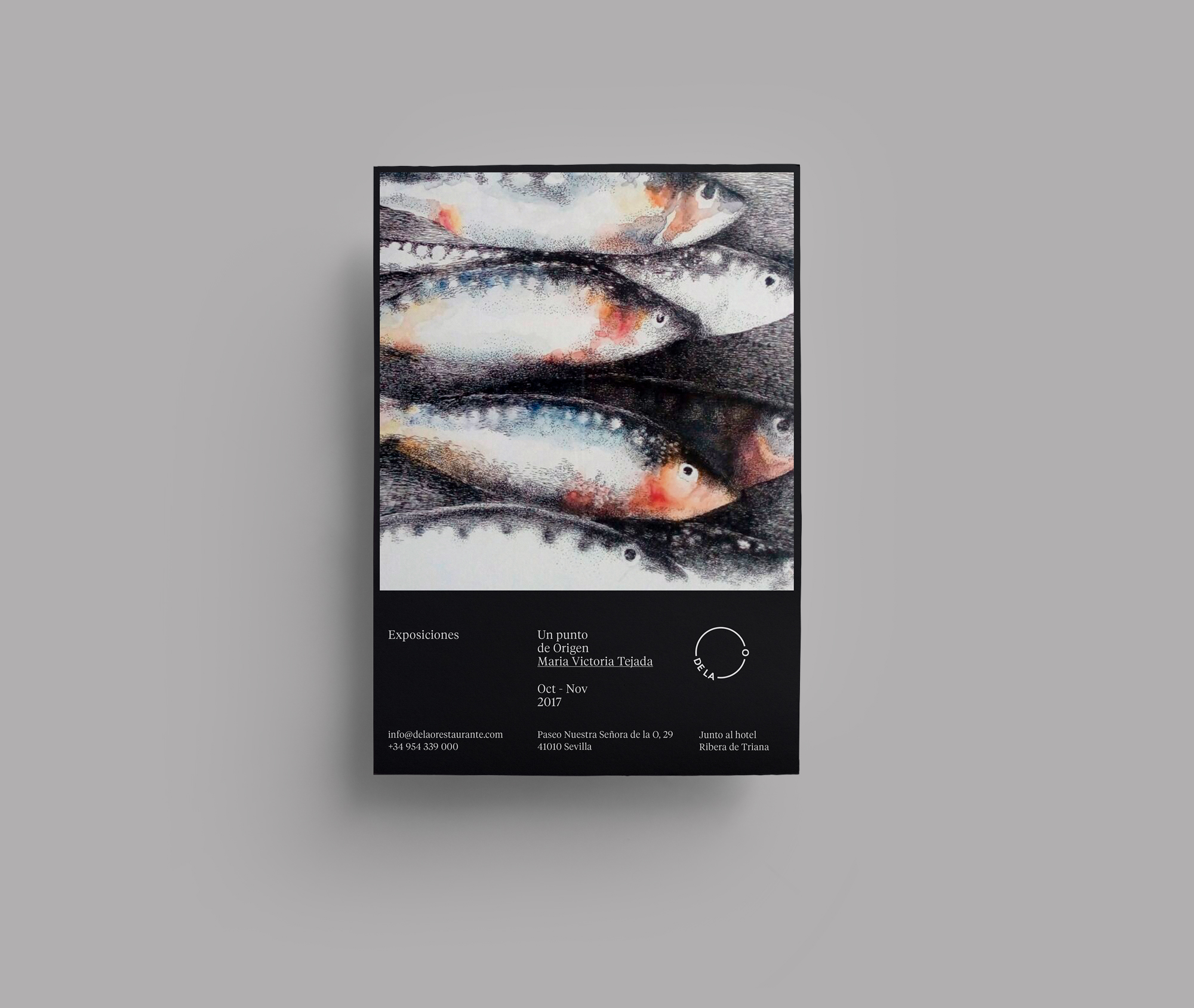
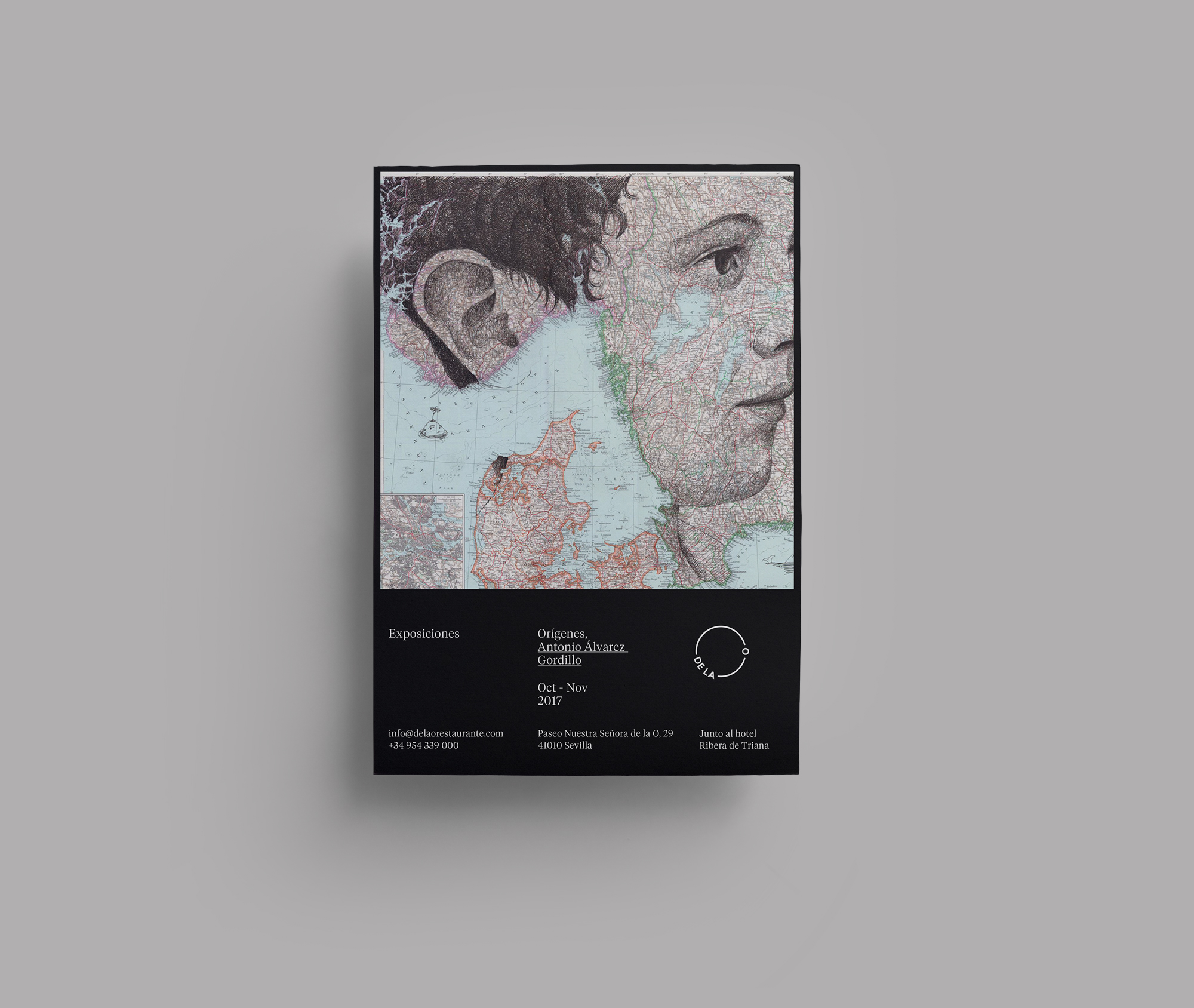
To develop the brand we worked together with the architects Gema Aguilera Gómez and Manuel Llerena Maestre, designers and owners of the restaurant. The range of colours were chosen from the materials used inside the premises, where the black of the entrance combines with the brown and grey of the walls and ceilings. These were used for the creation of all the different graphic elements: the website, stationary and a book, which as well as being the menu, also tells its history and provides information about events and exhibitions which take place there.