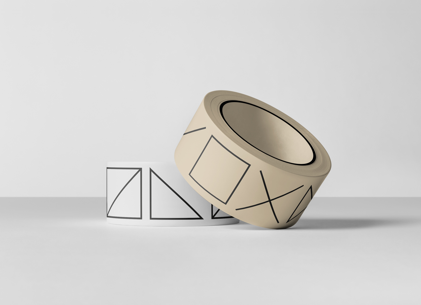
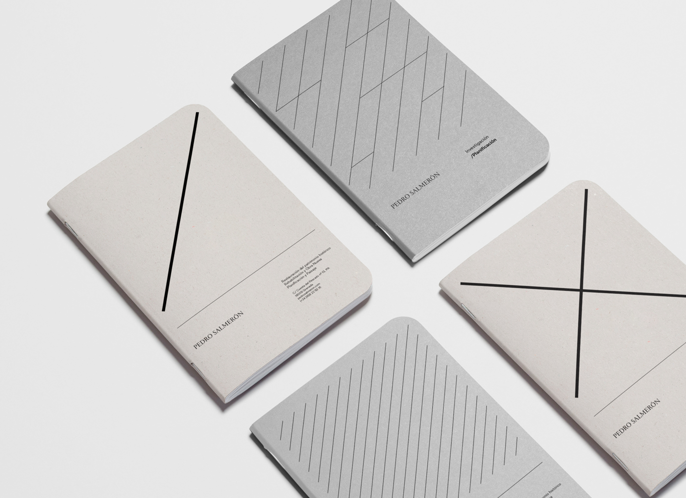
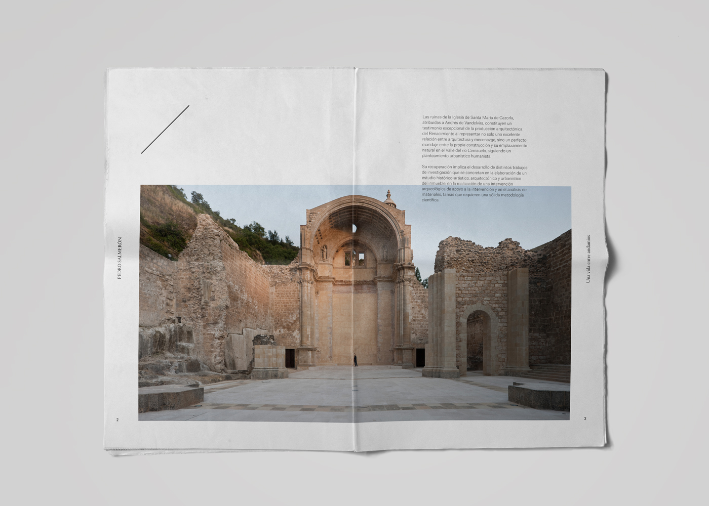
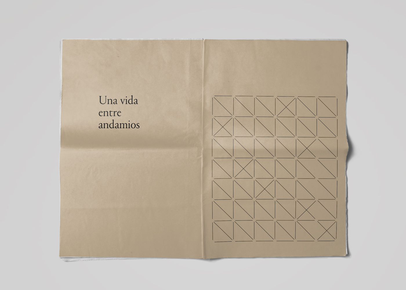
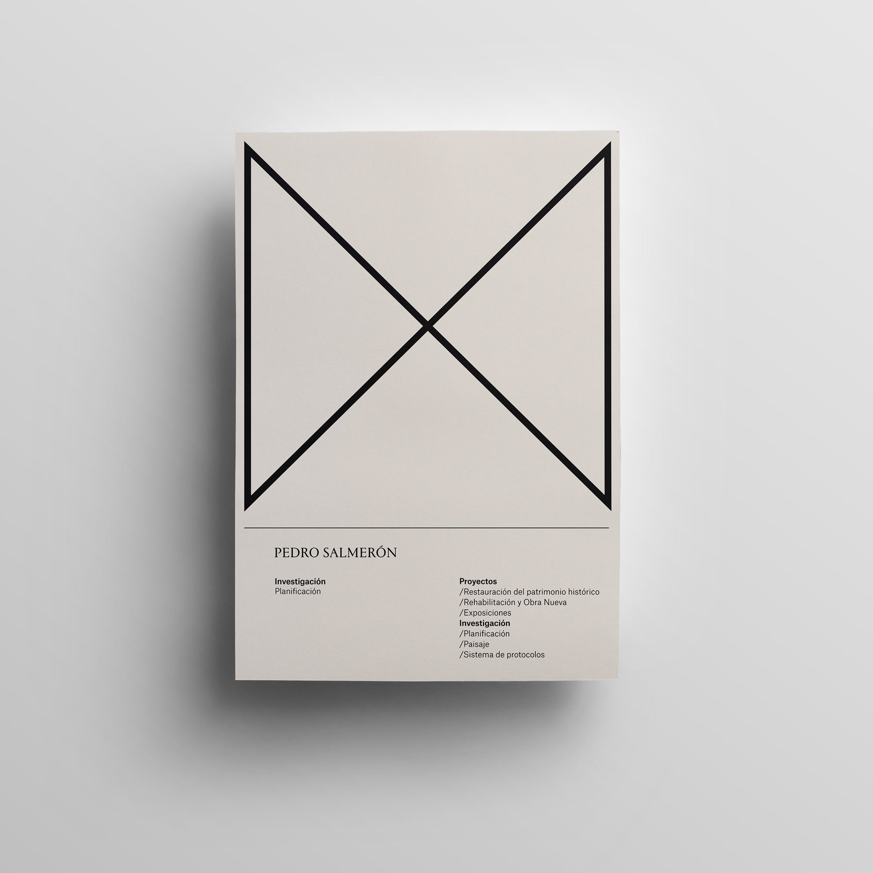
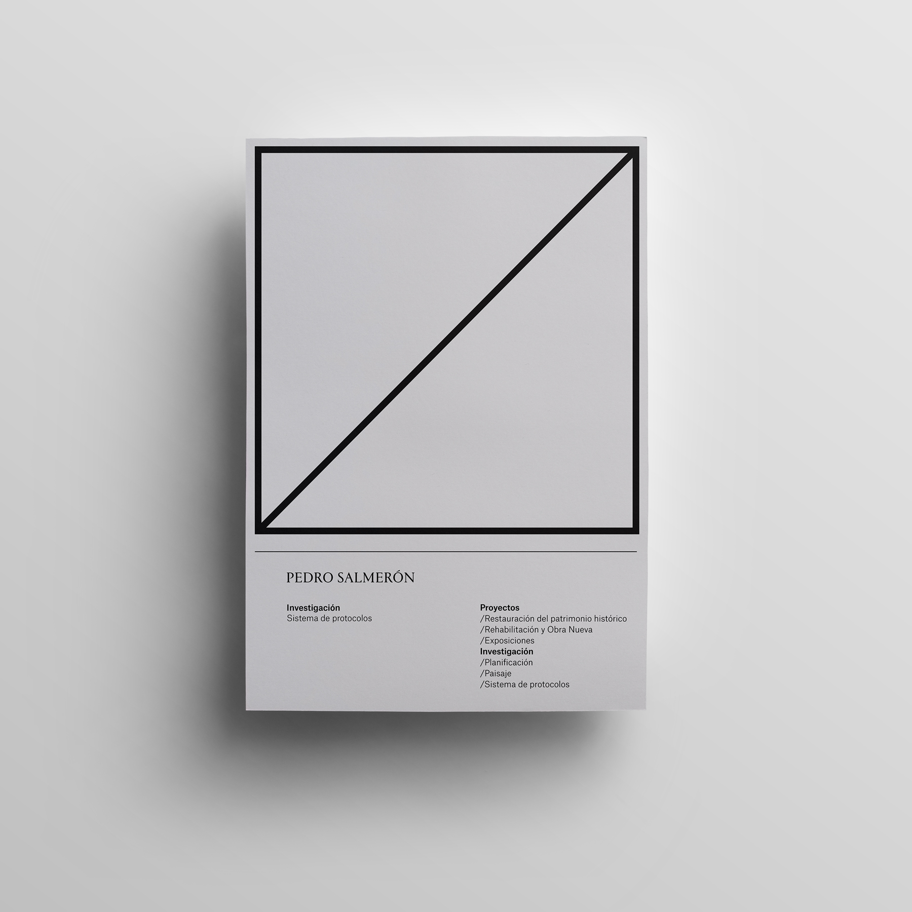
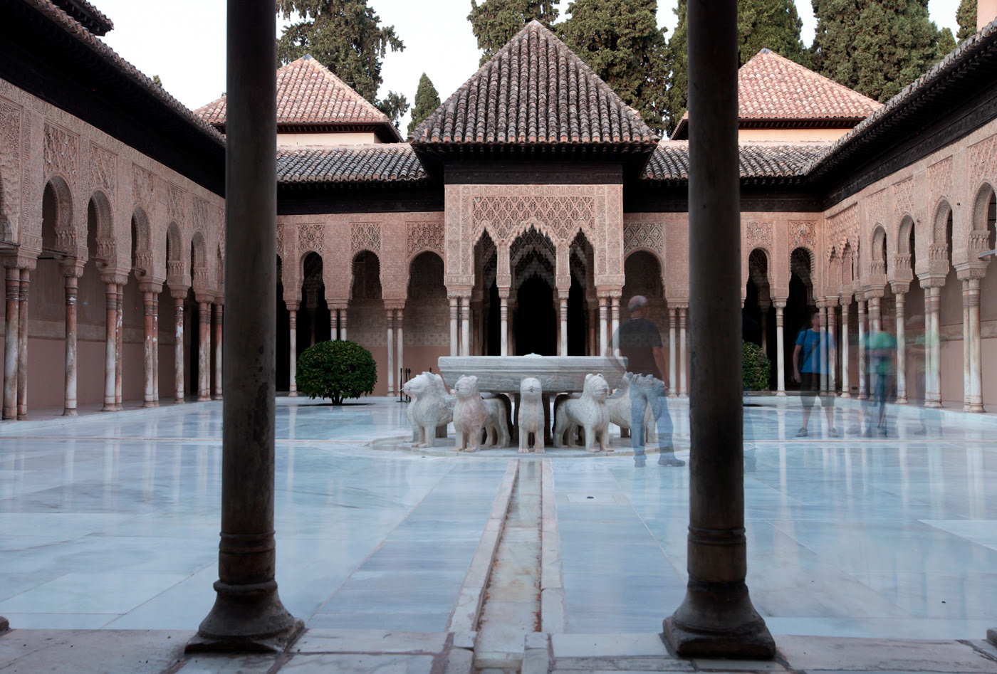
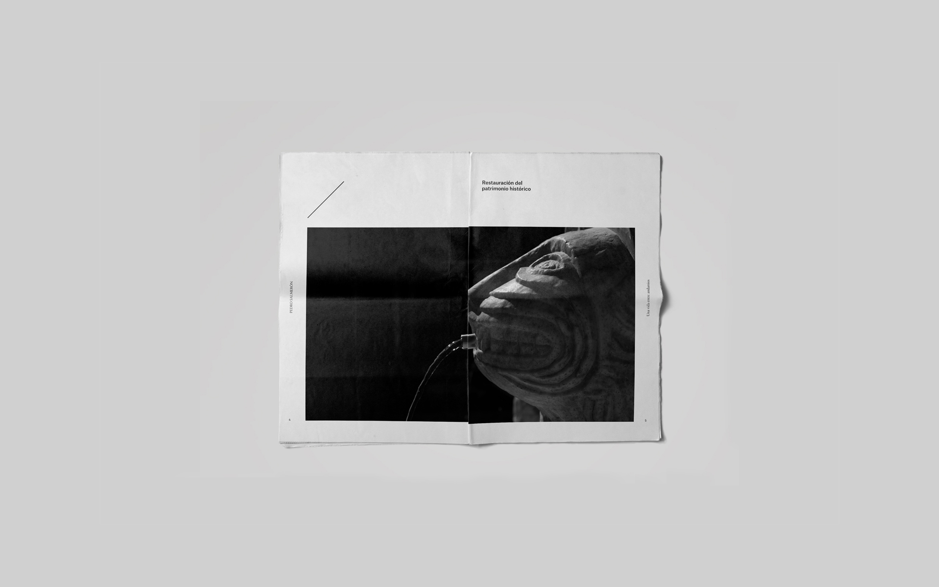
A life among scaffolding. This way you can summarize Pedro Salmerón’s professional career. This reputed Spanish architect, specializing in historical heritage, commissioned us with the development of a new brand for his architecture practice.
The challenge was an important one. It demanded a visual identity able to accommodating the several aspects and types of work while adapting, at the same time, to the different pieces in a harmonious and coherent way. Furthermore, it should maintain and support Pedro’s leading and relevant figure in its field.
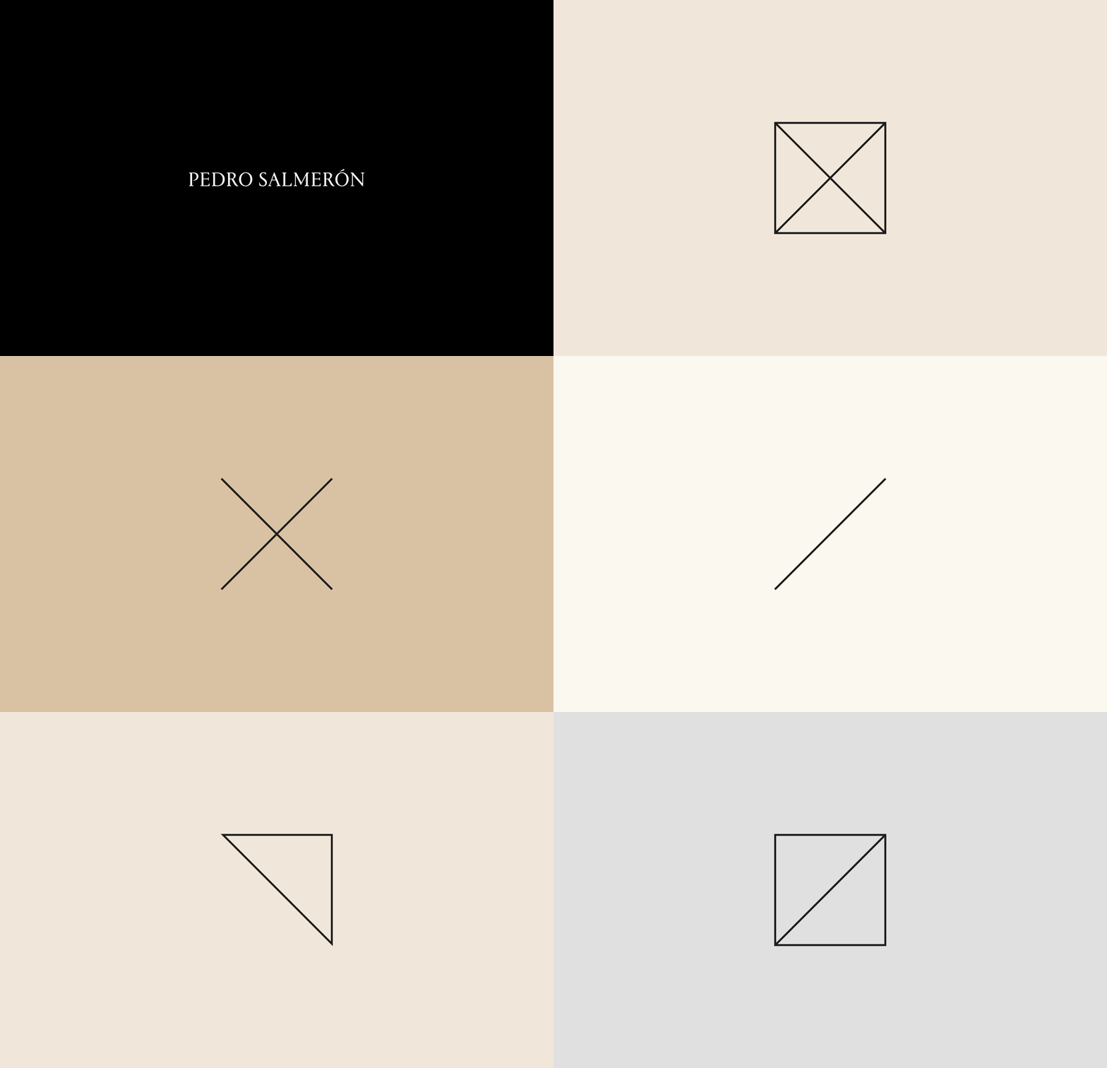
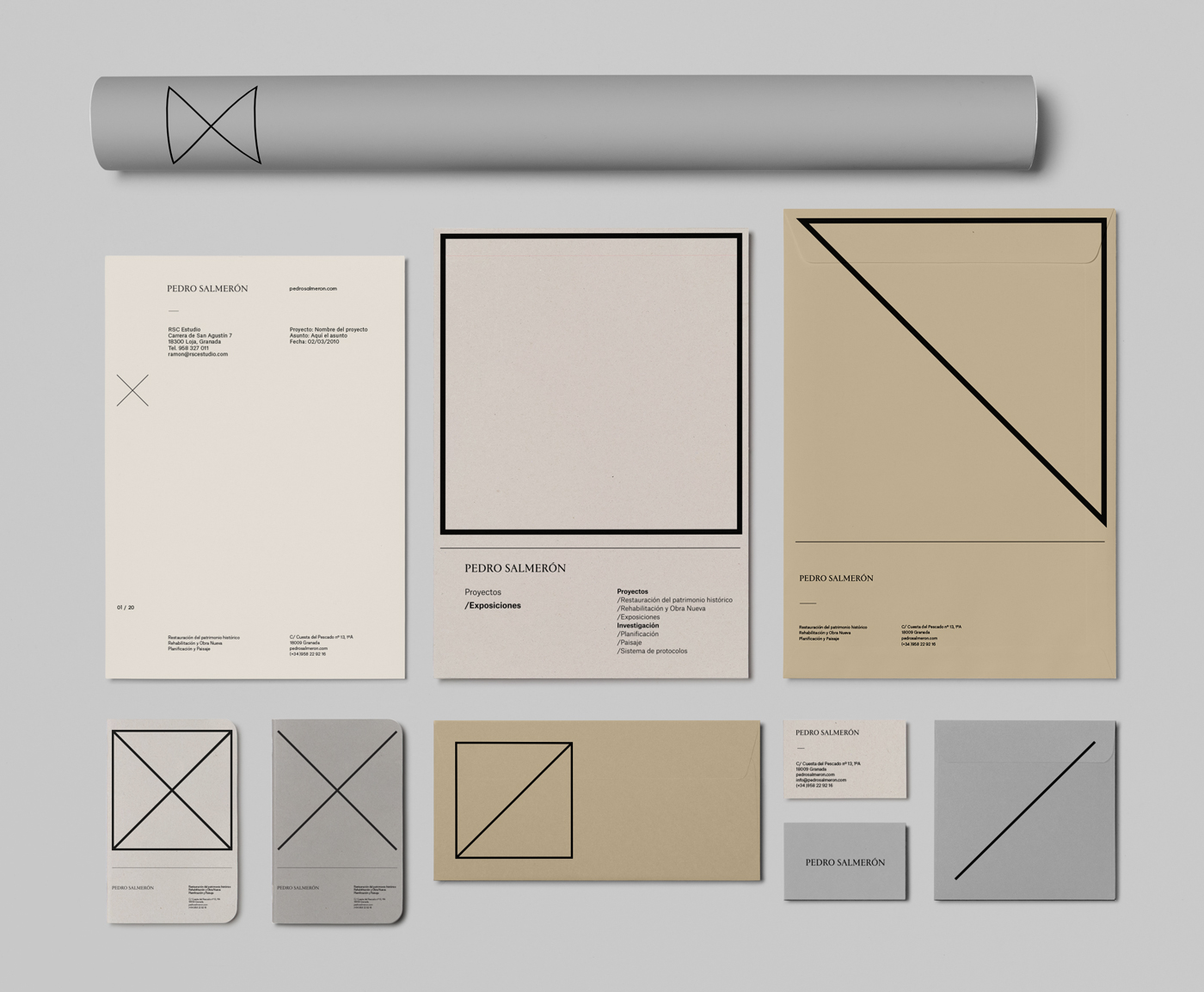
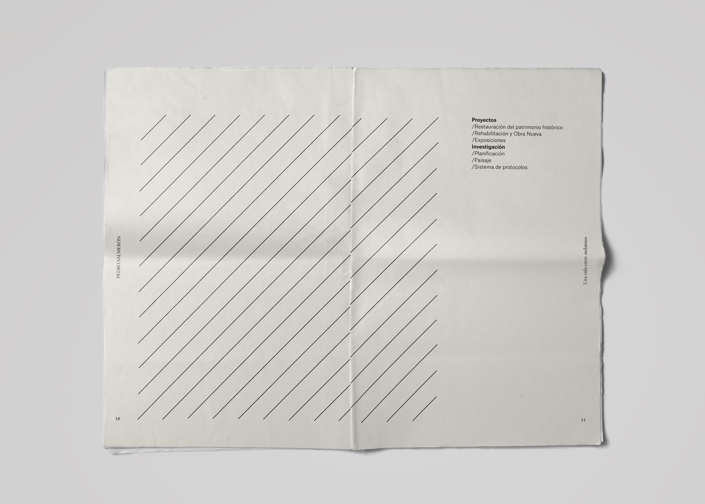
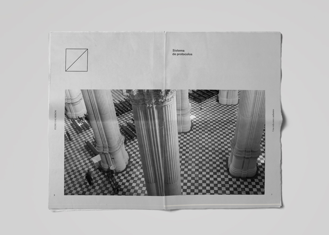
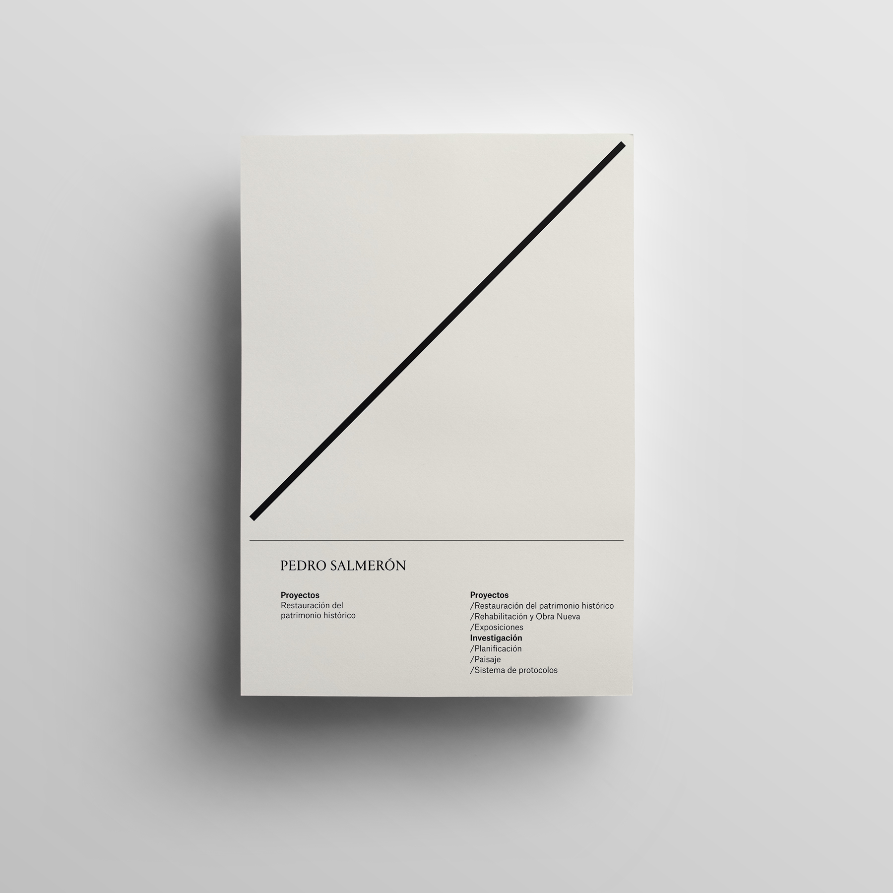
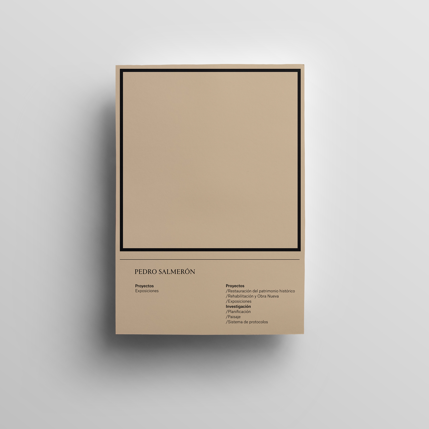
We created a complete yet flexible visual system with a clear aim: achieving a consistent, elegant and graphically rich brand. For this reason, we built up an identity based upon several layers or levels, getting away from traditional static representations. The conceptualization starts from the usual elements present in the rehabilitation and restoration tasks, such as classic typographic resources, colors and materials related to the architectural world or the structure of scaffolding always present in this type of jobs.
The result is a versatile and agile visual identity, which represents the essence of the study as well as allows a useful system of classification of works, projects and investigations.
