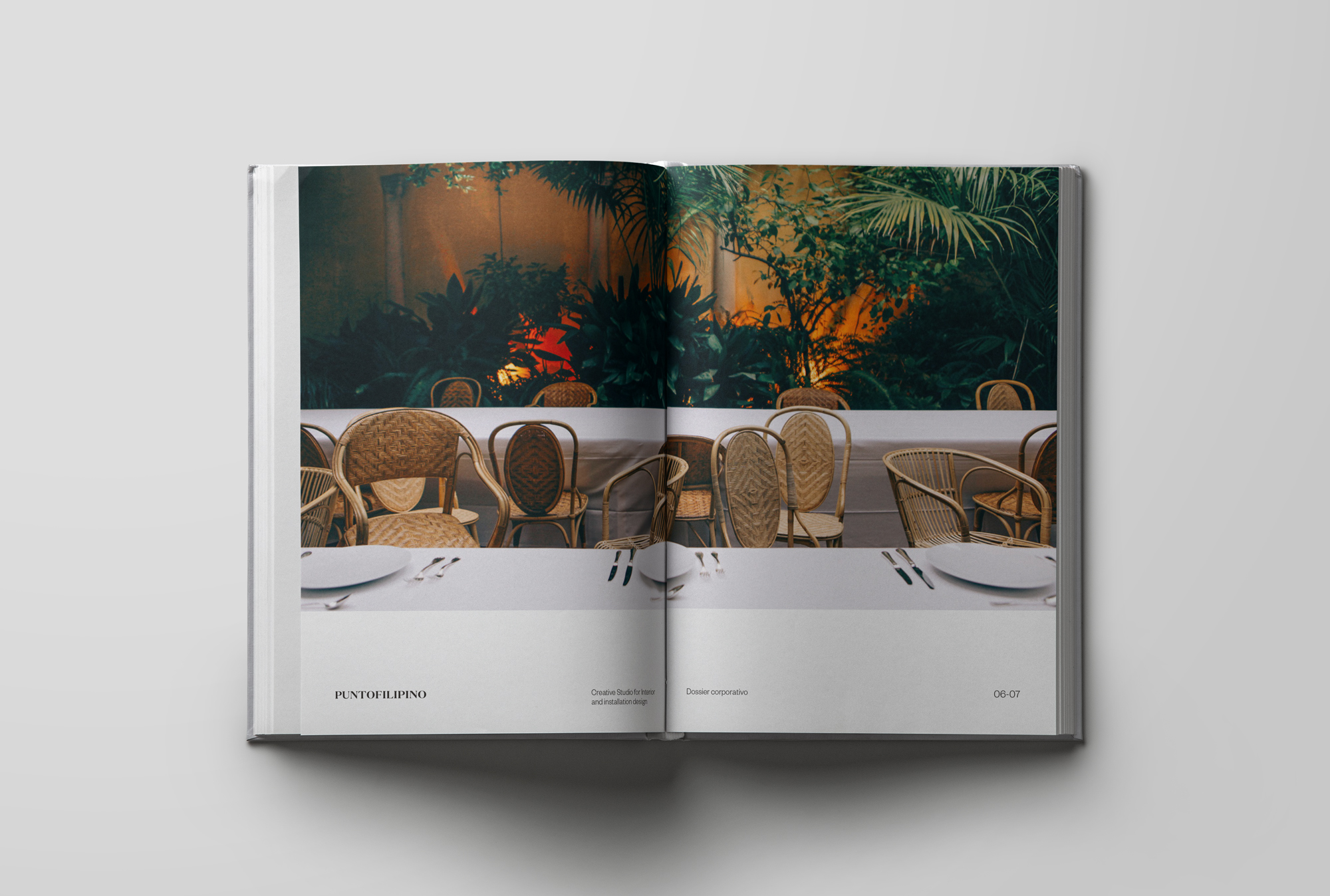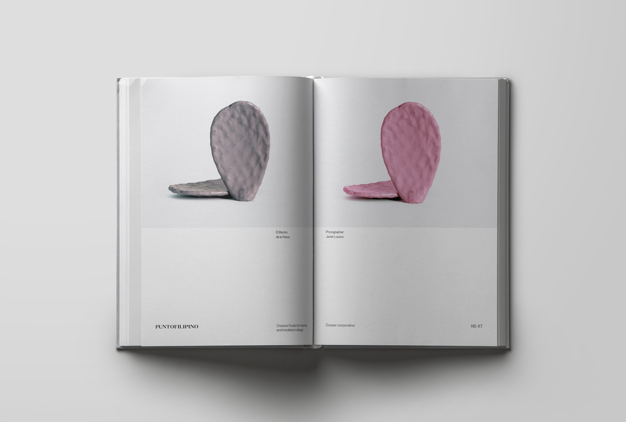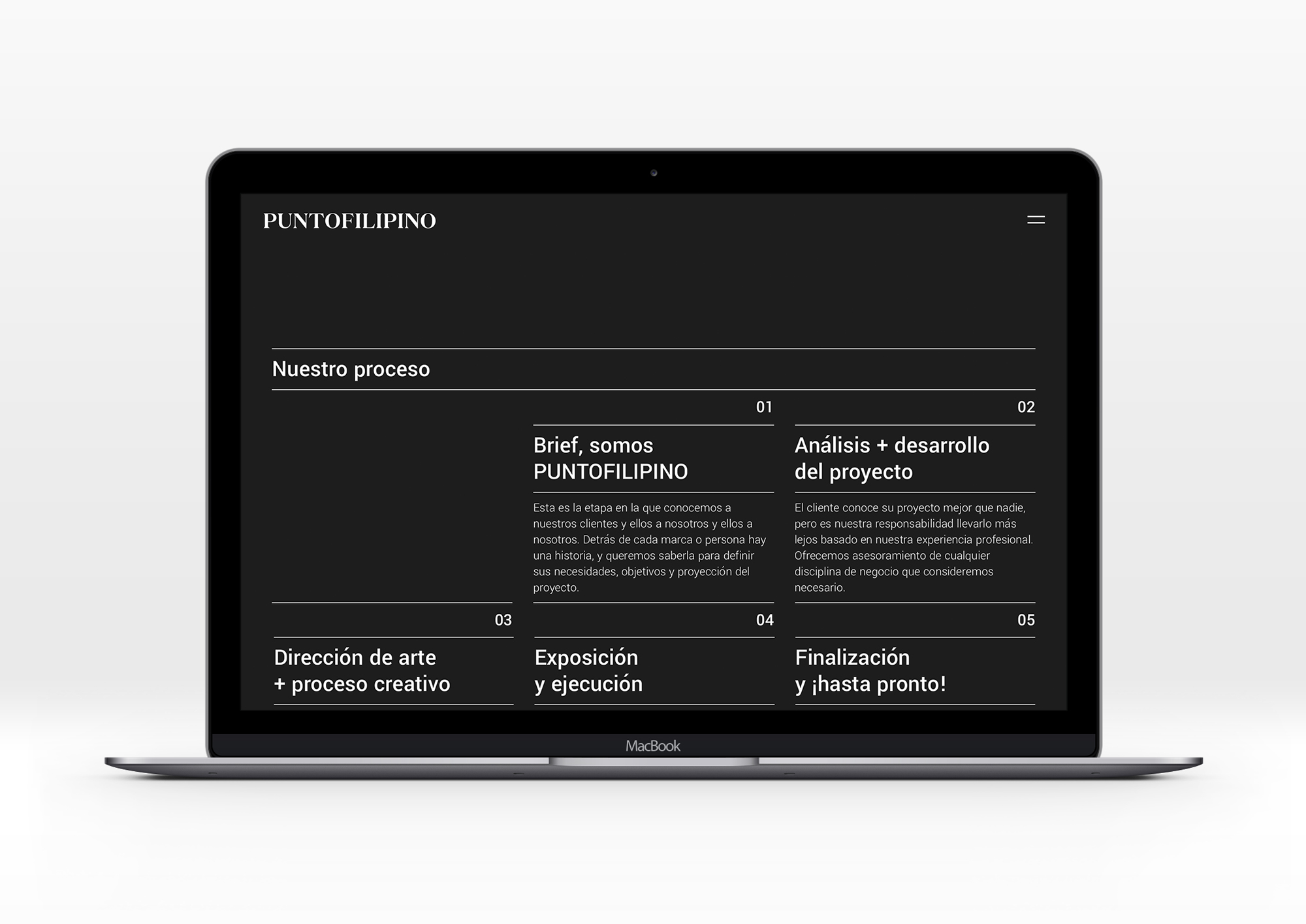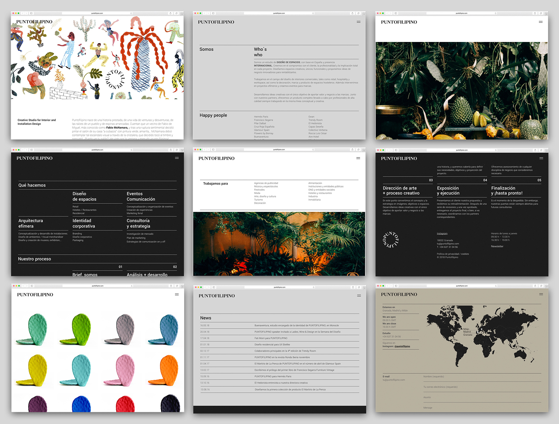
Puntofilipino, an interior design studio based in Granada, Madrid and Milan, entrusted us with a complete redesigning of their brand, which would allow them to communicate in a clear uniform way.
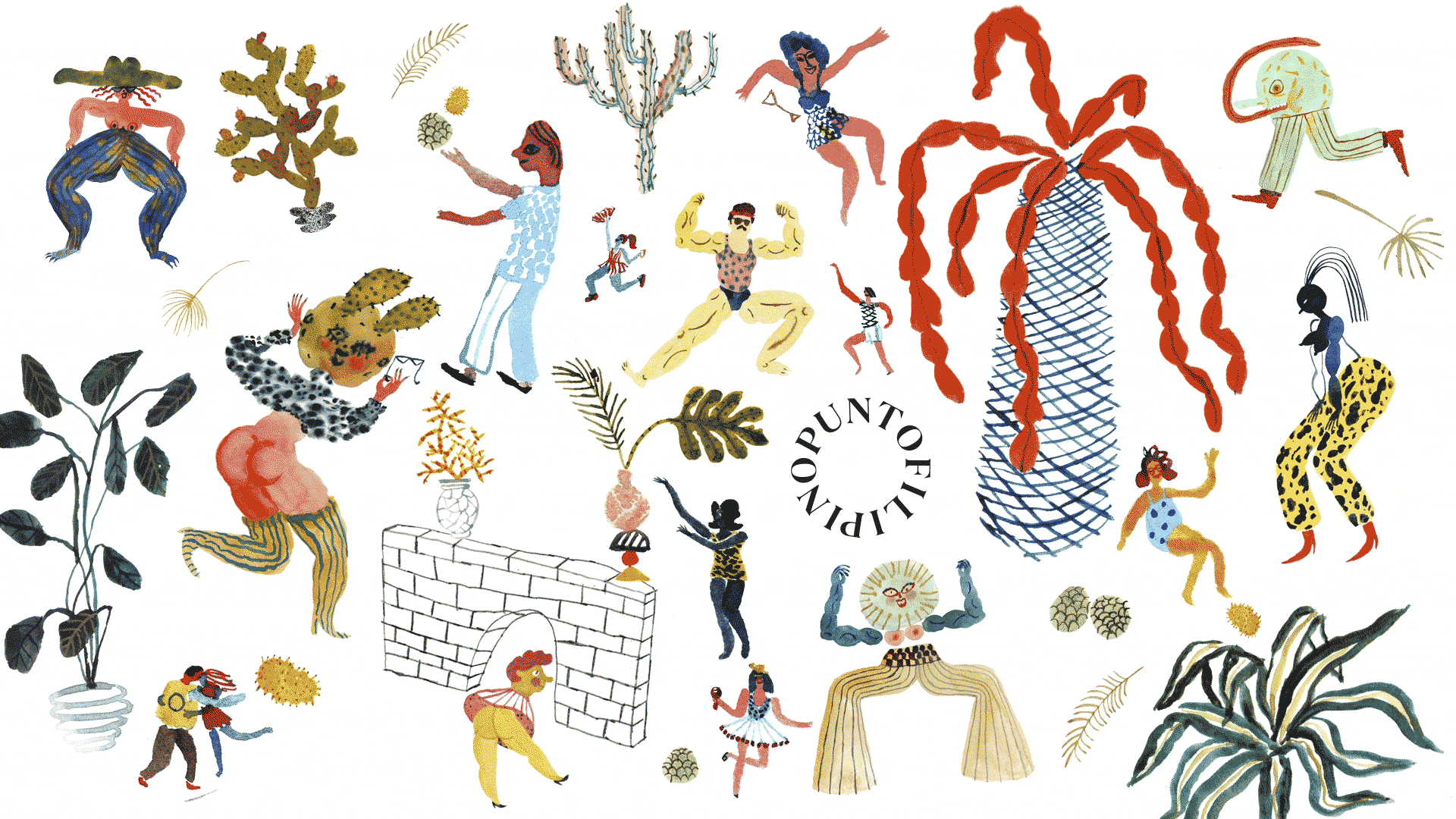
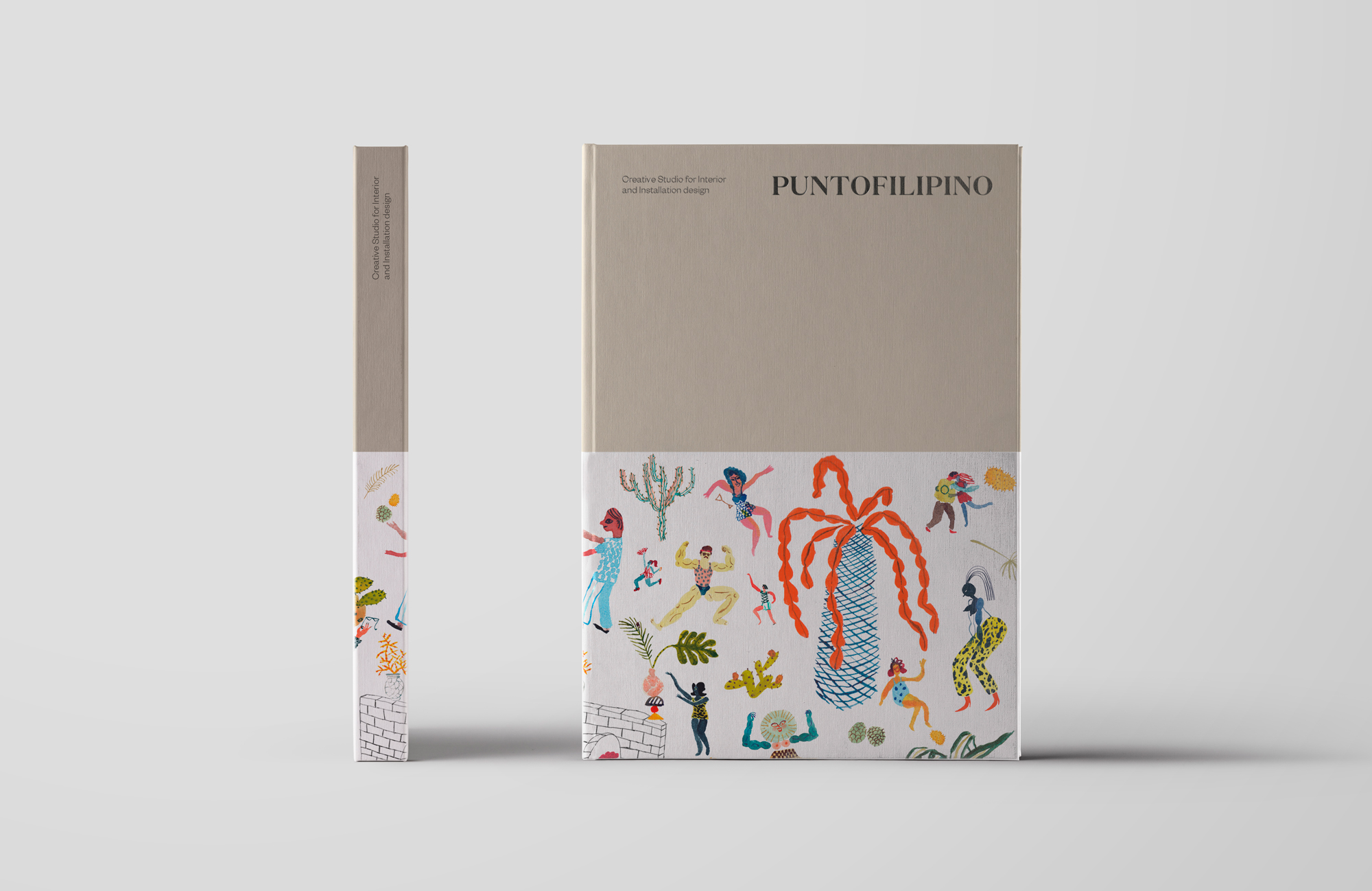
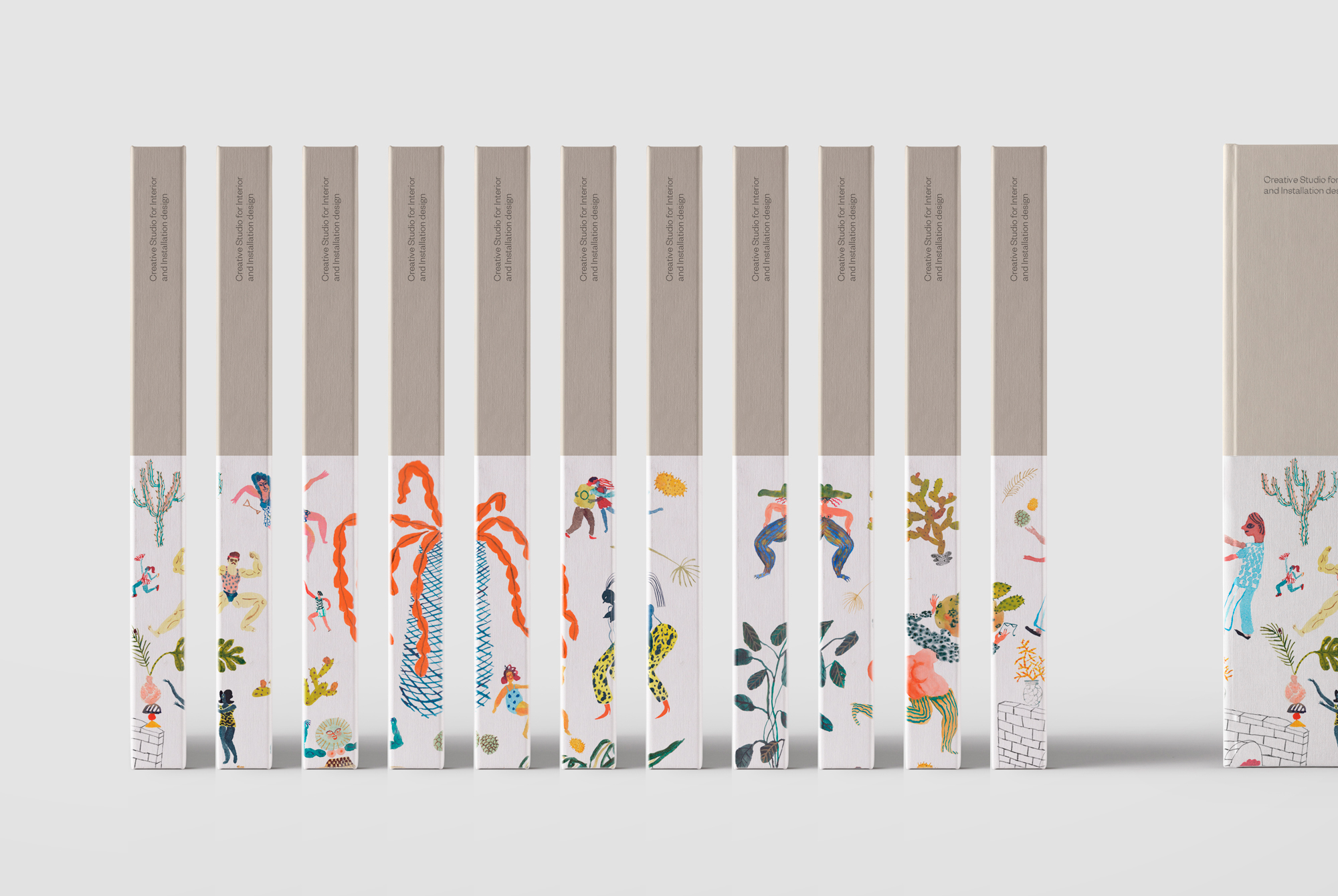
The company required versatility, something which would enable one-time collaborations with different artists, without losing their essence, a kind of showcase where this company’s different phases and milestones could be displayed.
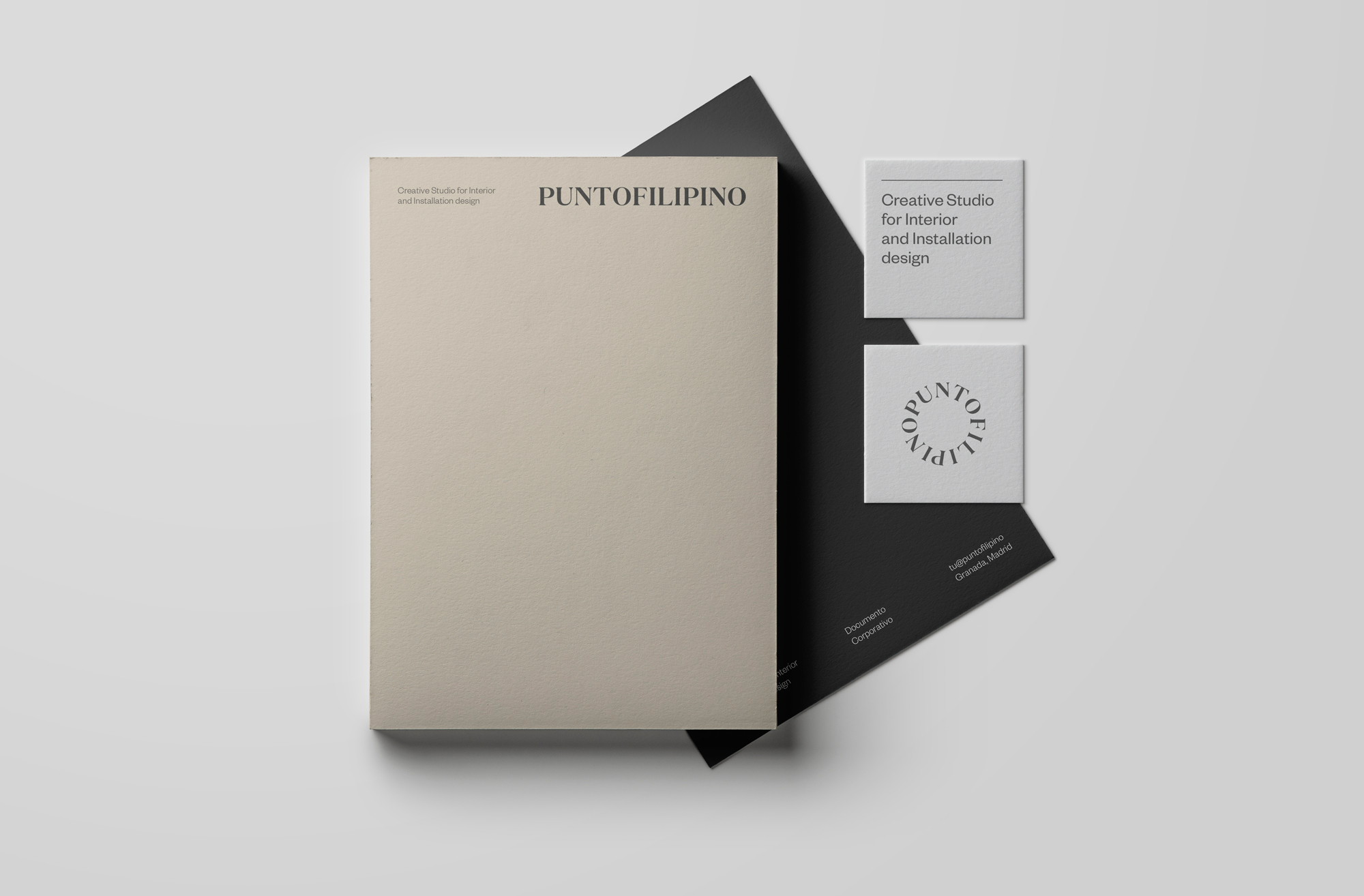
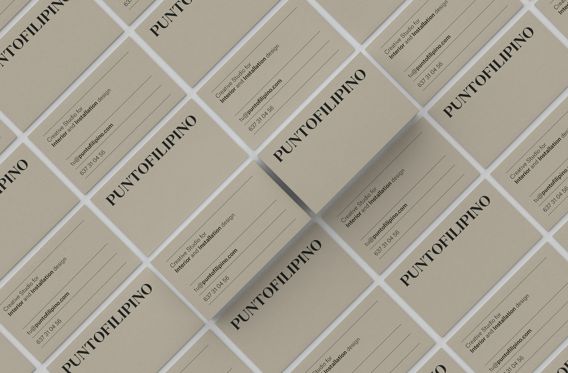
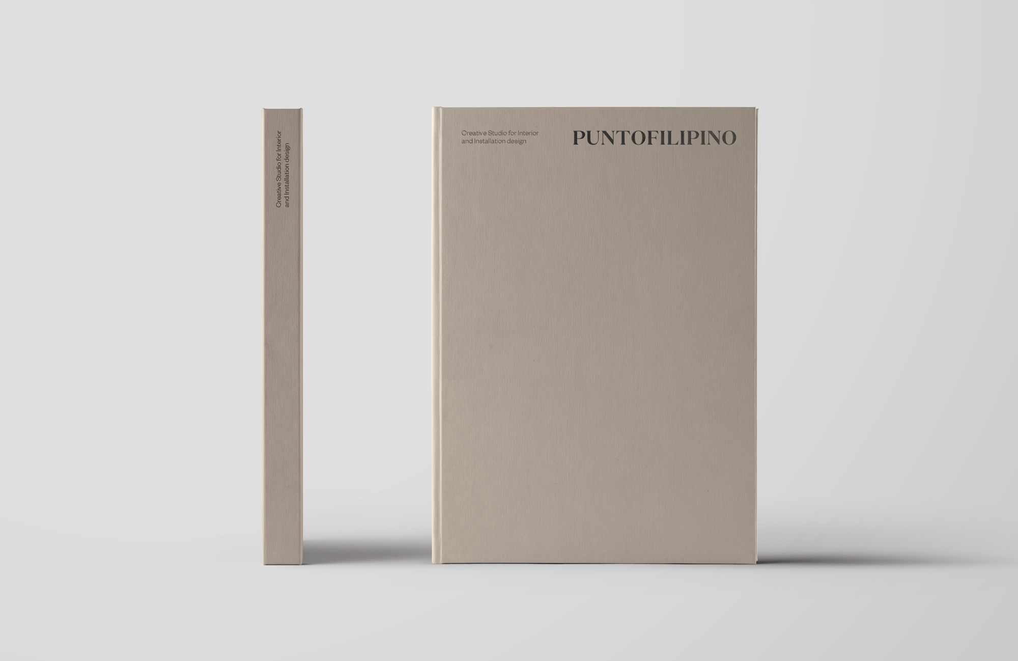
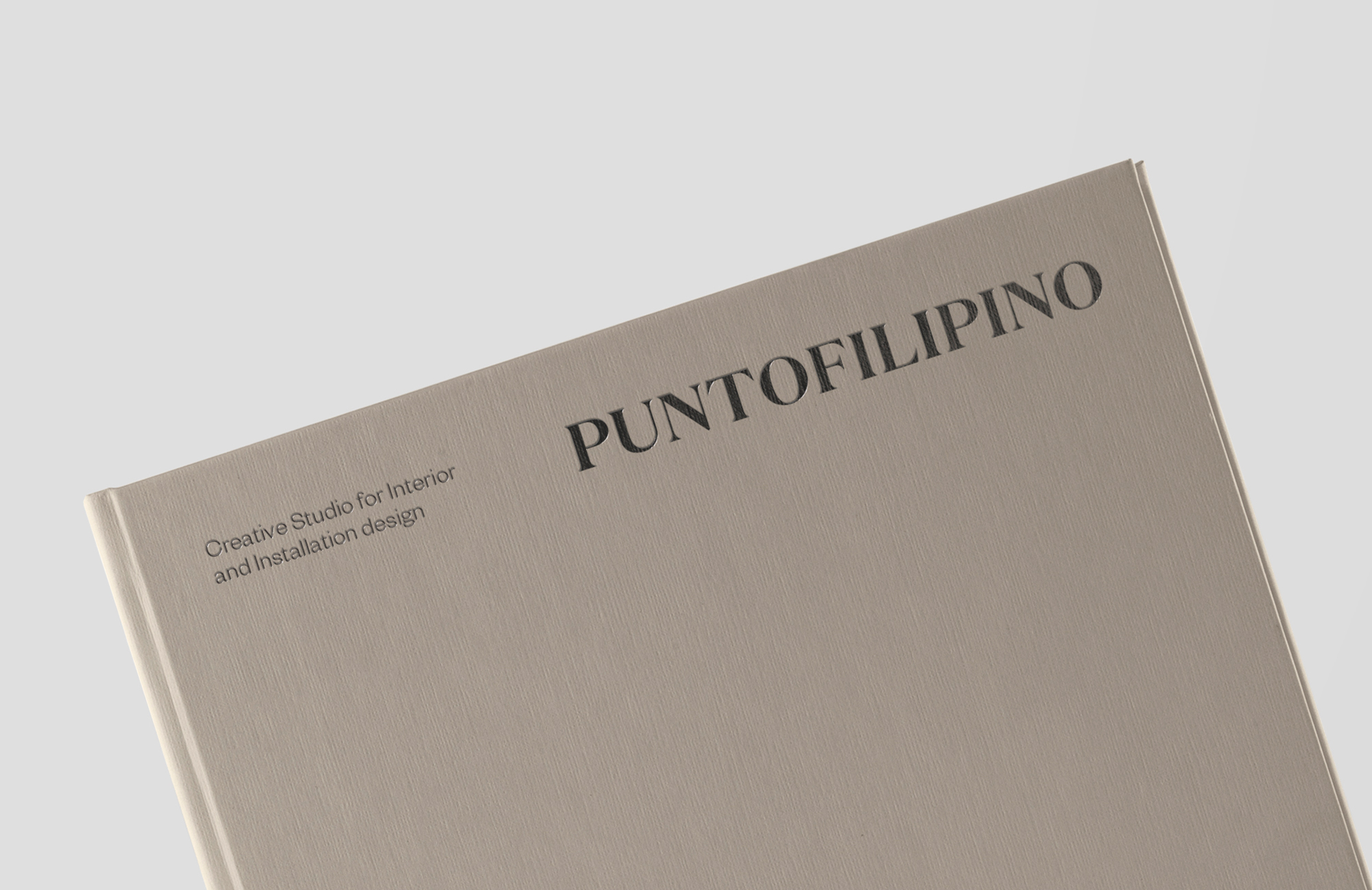
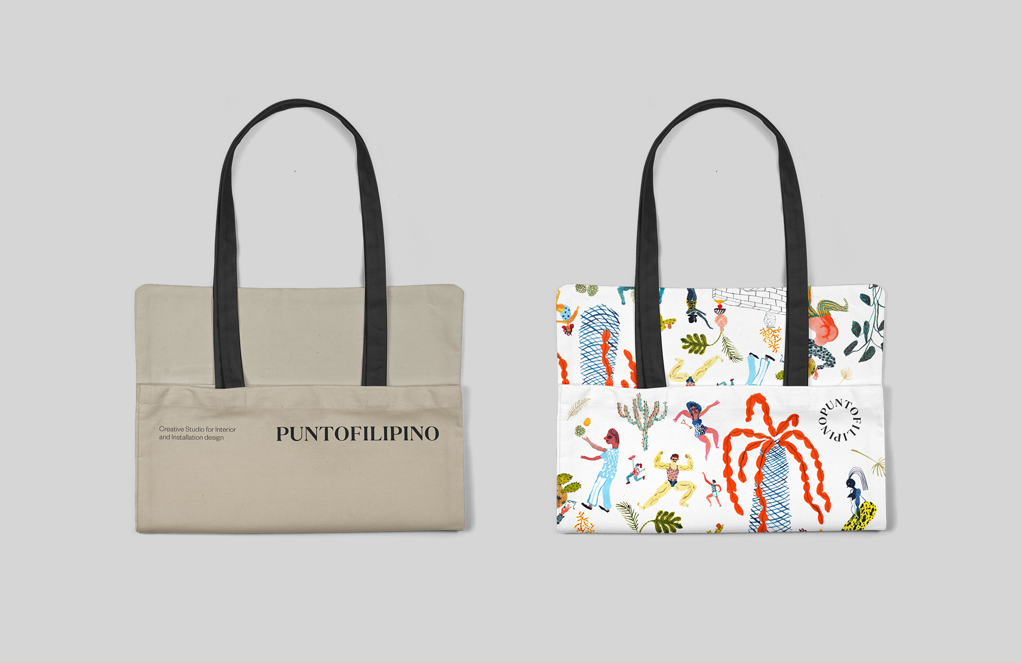
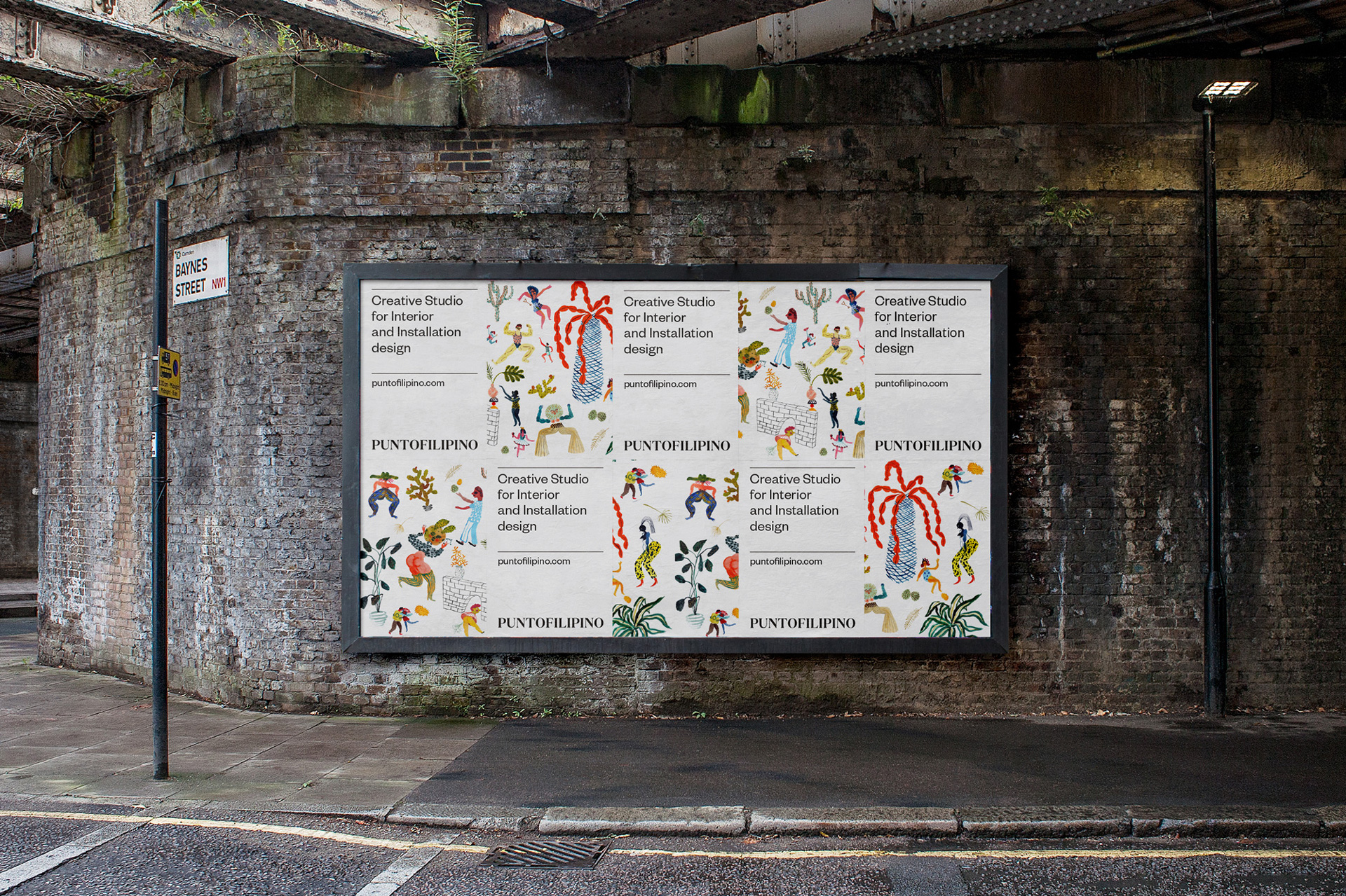
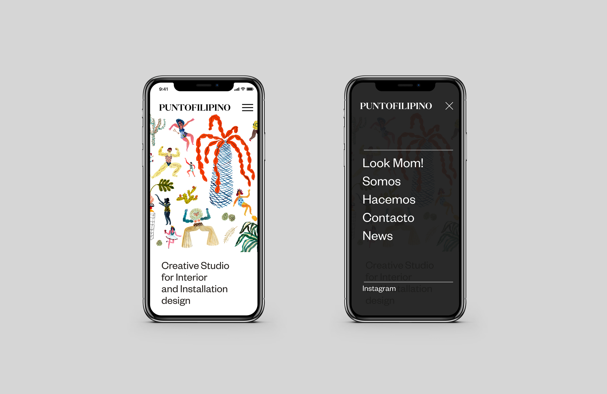
Puntofilipino was looking for an identity with a balance between classic and modern. With this in mind, a font was used as the main element and means of communicating the brand. A serif font with a great deal of personality and reminiscent of a classic era, accompanying a minimal, clear, direct brand.
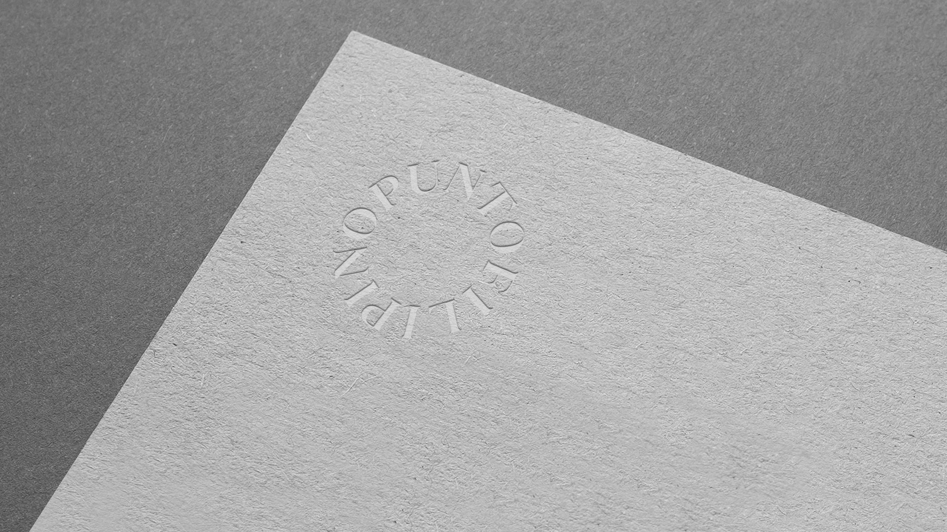
How was it represented conceptually?
PUNTOFILIPINO: a fundamental characteristic or trait of somebody or something that is more mischievous or daring. The aim was to graphically capture this fundamental trait in an abstract manner. We designed a circular version, a dot. Conceptually, the Logo comes together forming a dot which acts as a seal of quality and a guarantee.