Serena is a consulting firm working on continuous strategic planning. It provides personalized support services to companies seeking to face new market needs, be sustainable over time and increase their level of competitiveness.
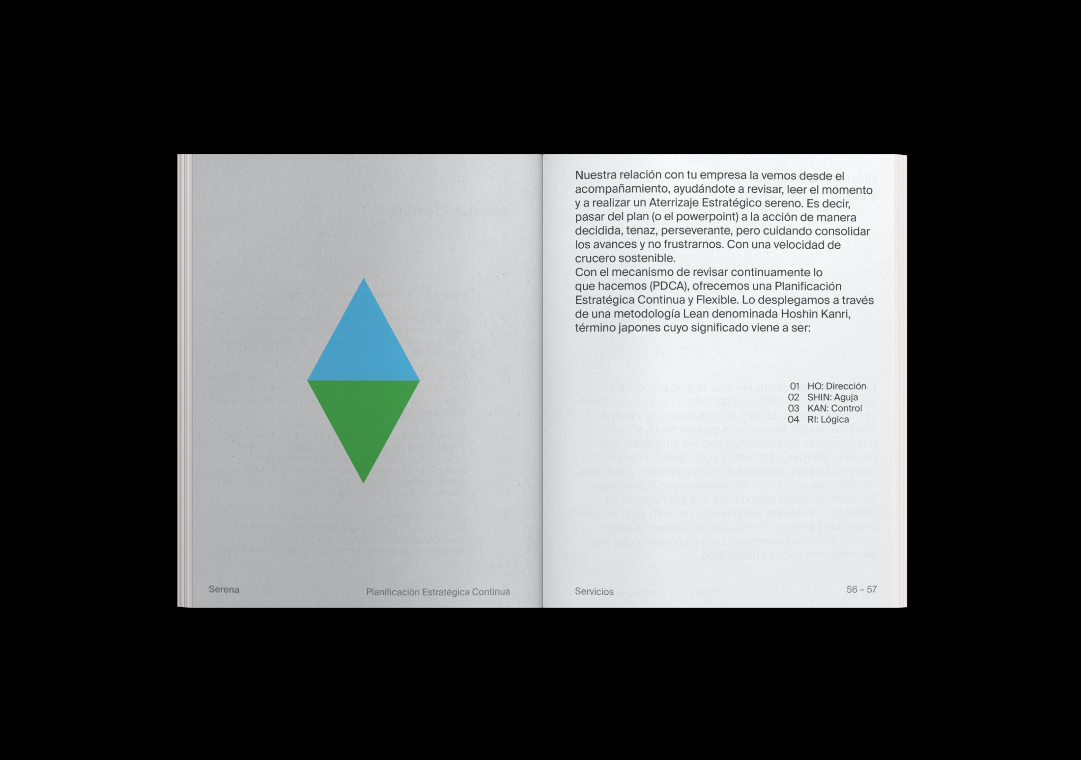
Serena’s name refers to the philosophy and values of the company that sets serenity at the center as a mean to achieve objectives. The work of this consulting firm is based on the Hoshin Kanri methodology, a Japanese term composed of four words, Ho, Shin, kan and Ri, which can be interpreted as direction, needle, control and reason, respectively. Taking into account the above, this working methodology acts as a management compass.
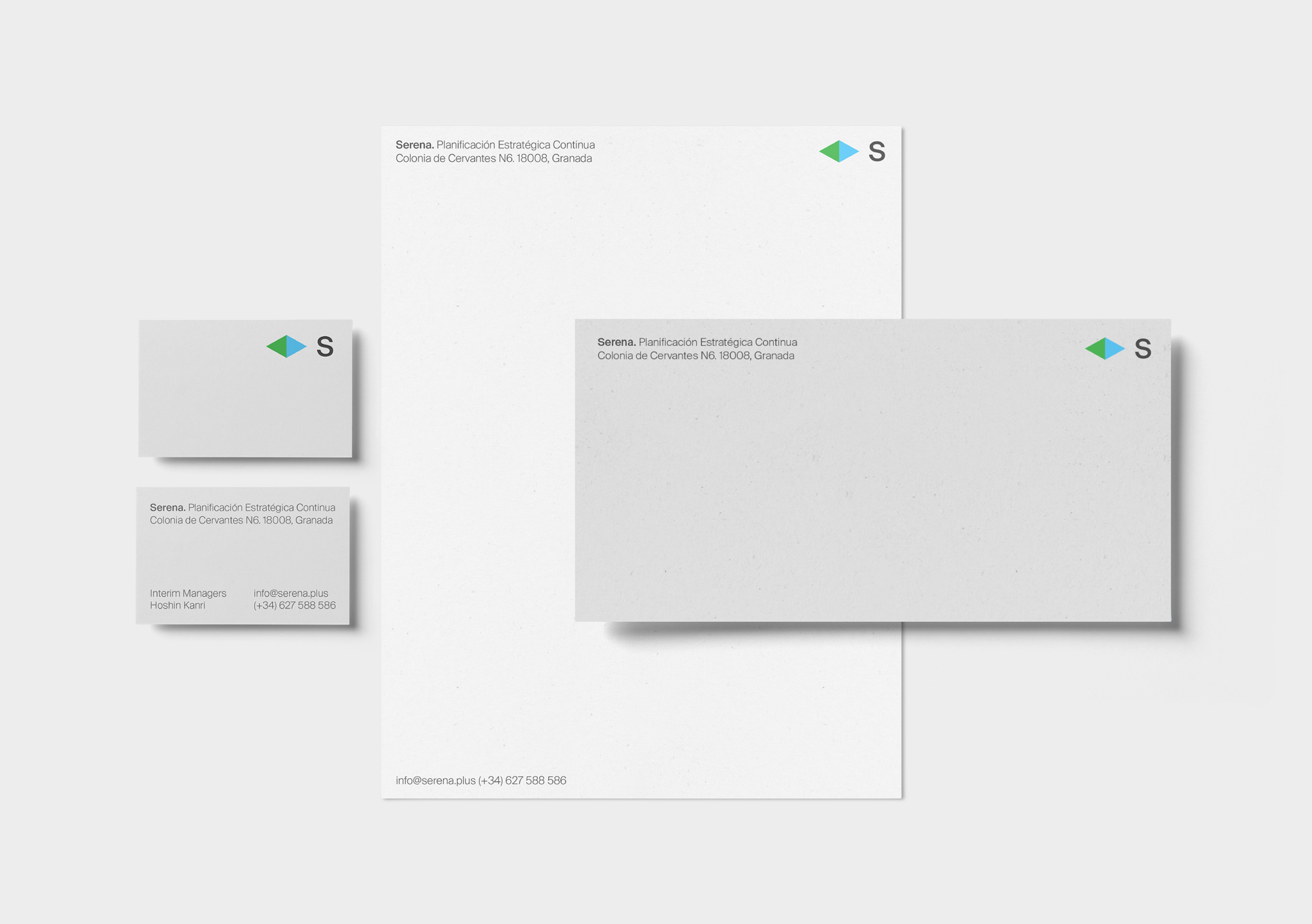
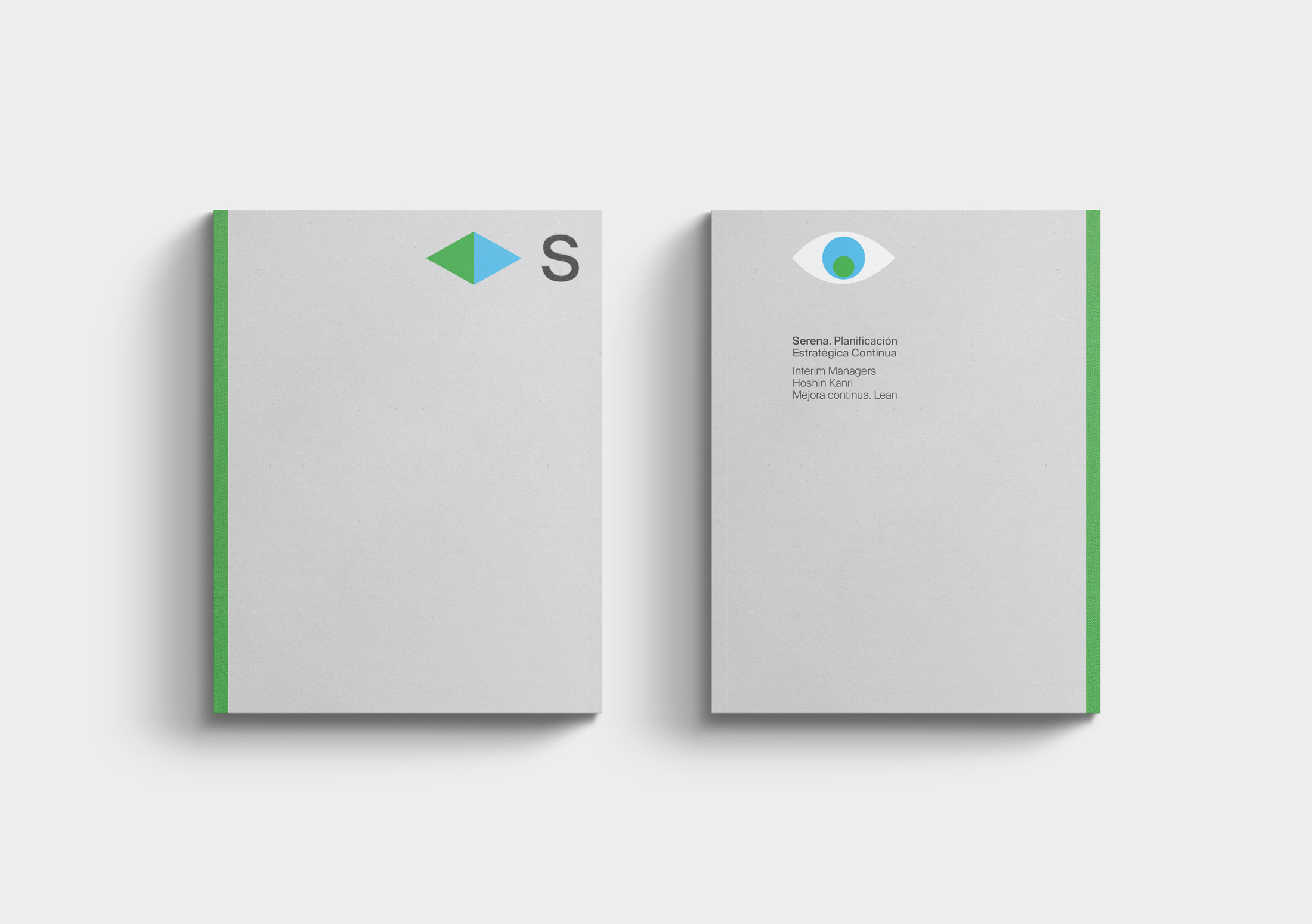
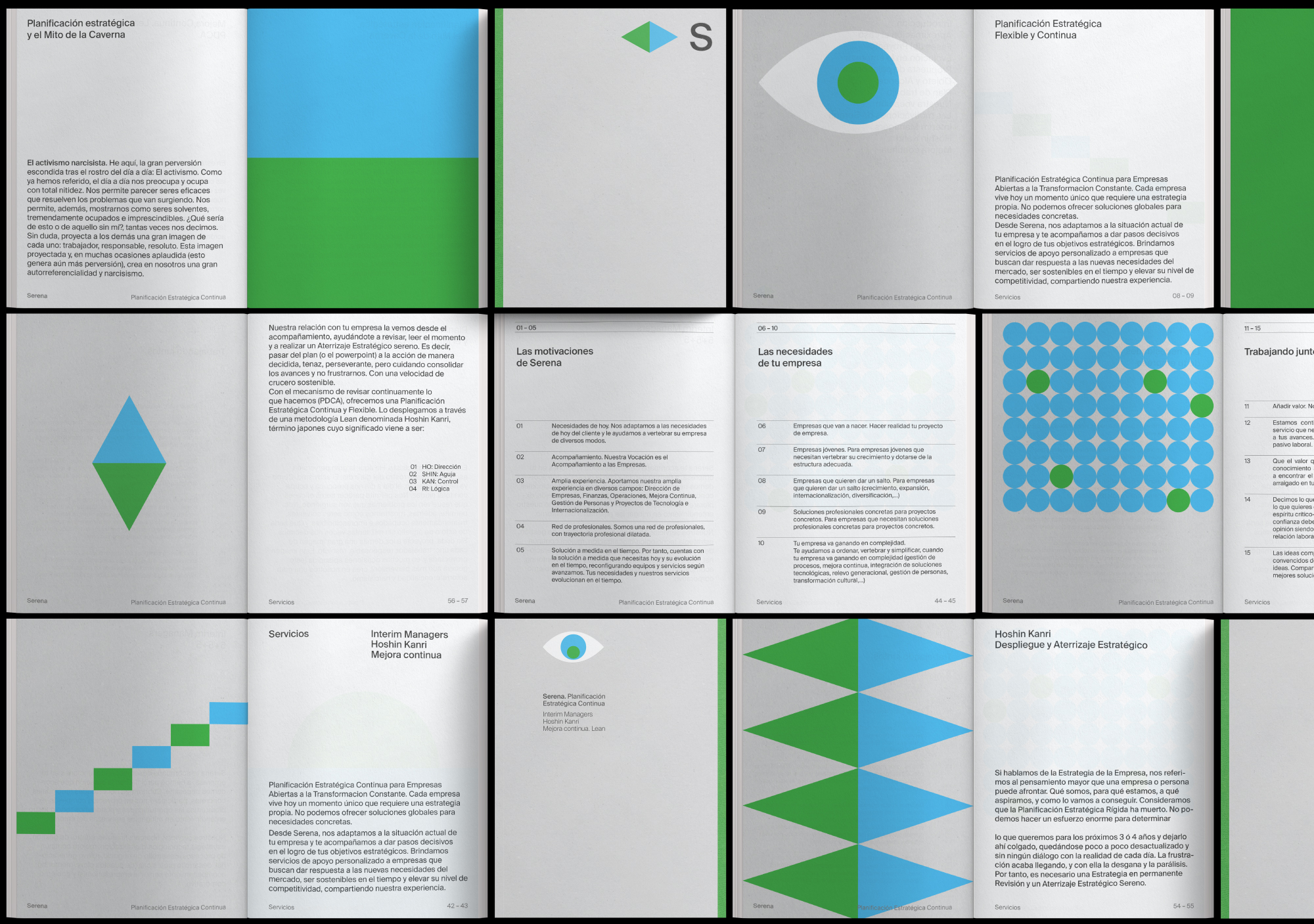
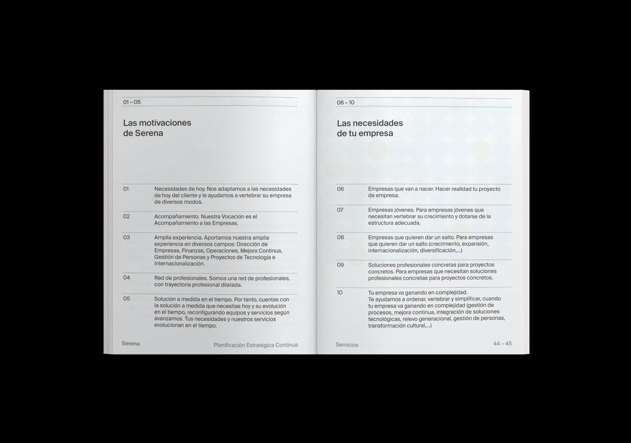
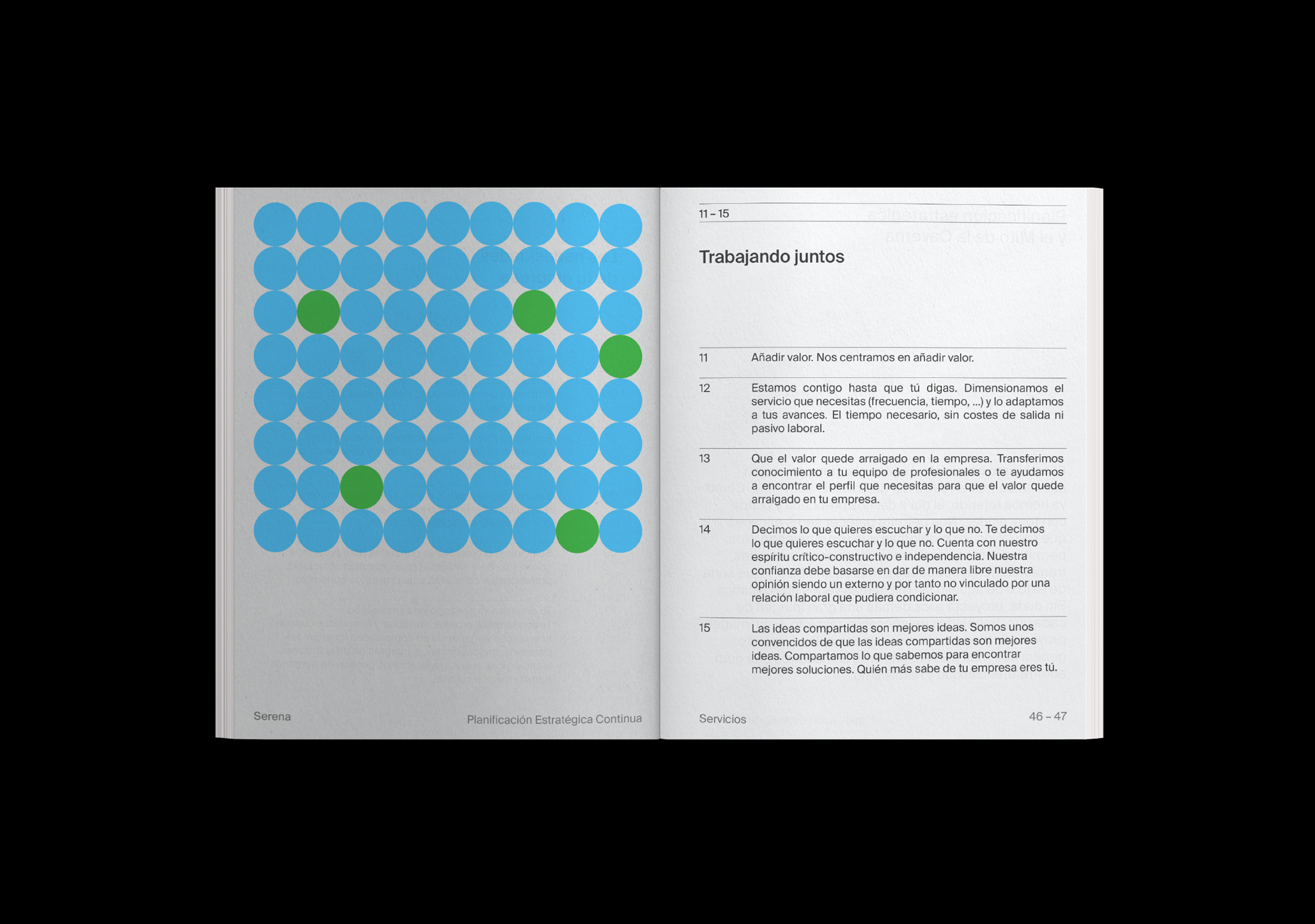
For the development of its visual identity, a flexible visual system is built that revolves around the concepts of direction and control (Hoshin Kanri), where the symbol of the identity acts as a compass, always in constant movement, where the initial S of the brand, points the way to follow or final objective, as a simile of what Serena can do for their customers. Through this dynamic language and supported by a reduced and serene chromatic palette, we generate all the online and offline pieces of the brand, such as stationery, corporate dossier, website and a video that reflects the values of the company.
